Natural Path Studio.
Brand Identity ✹ Print
Blending holistic healthcare with bold editorial direction.
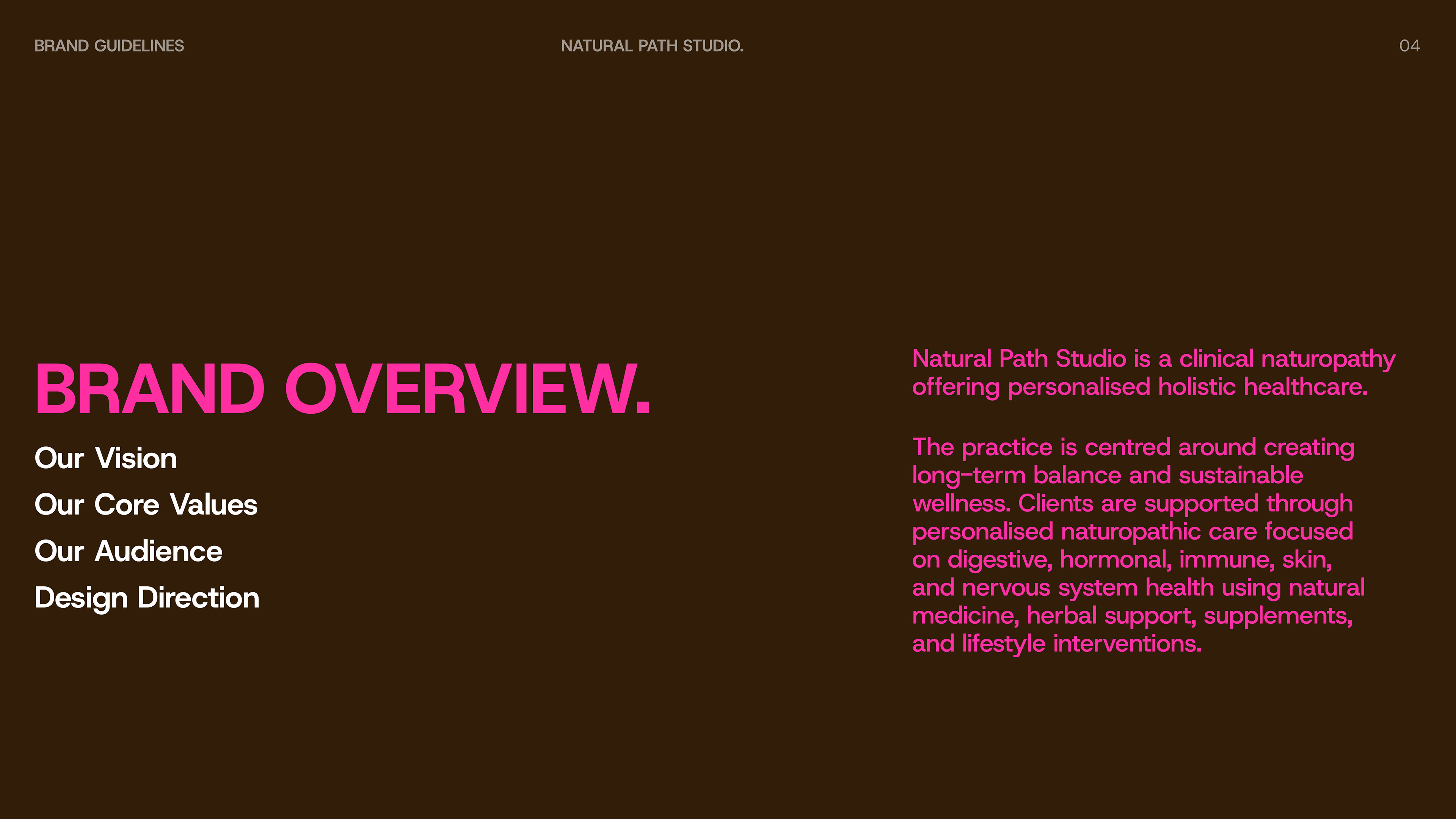
Natural Path Studio envisions a thoughtful approach to holistic healthcare — one that feels calm, personalised and supportive.
The practice is centred around creating long-term balance and sustainable wellness. Clients are catered through personalised naturopathic care focused on digestive, hormonal, immune, skin, and nervous system health using natural medicine, herbal support, supplements, and lifestyle interventions.
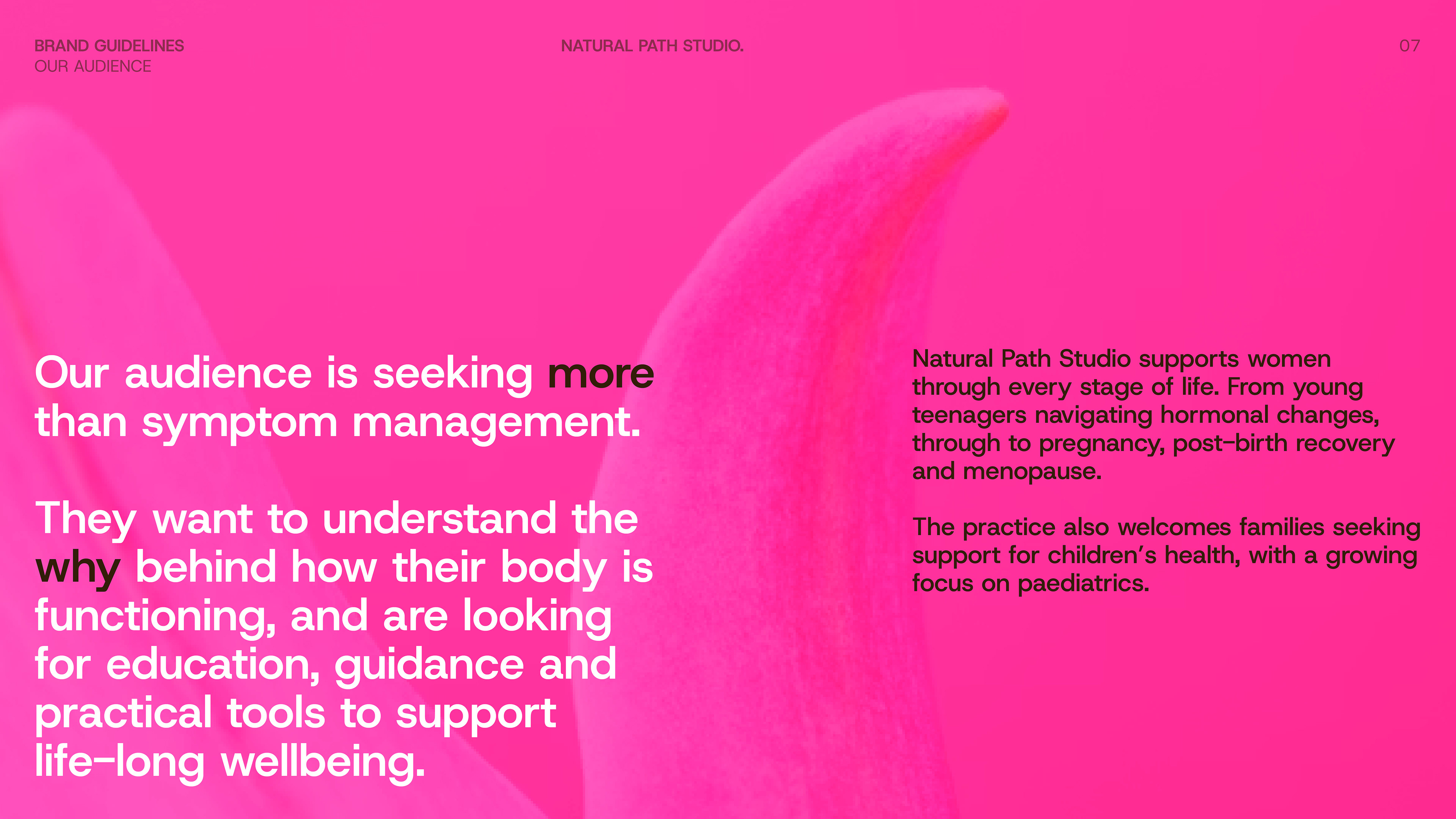
The studio supports women through every stage of life. From young teenagers navigating hormonal changes, through to pregnancy, post-birth recovery and menopause.
The PROCESS
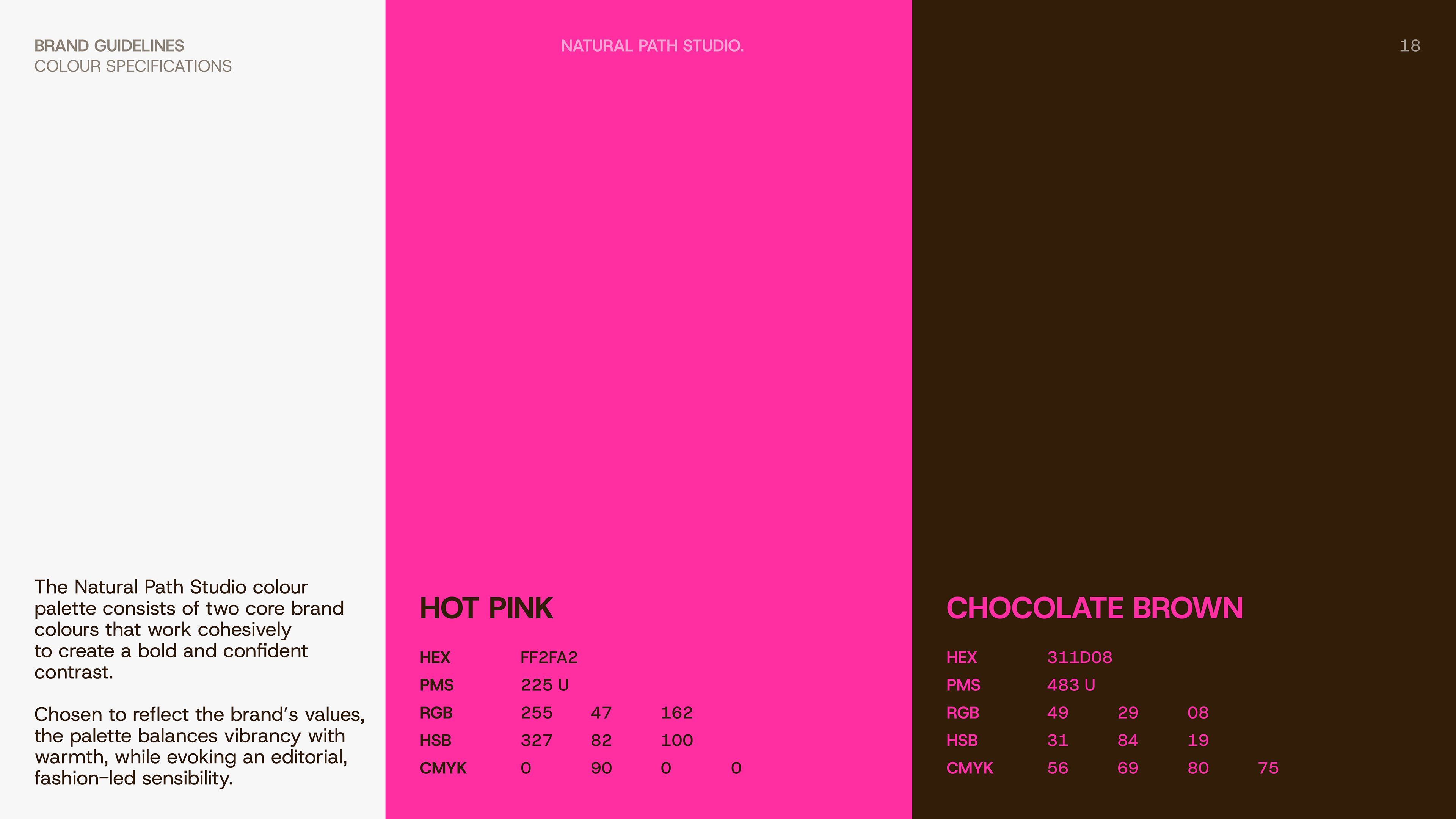
Starting from the ground up, the process began with in-depth discovery and strategic exploration to define the foundations of the newly found business. This informed the development of a complete identity system, including a primary logo, refined colour palette and considered visual direction in the form of a style guide.
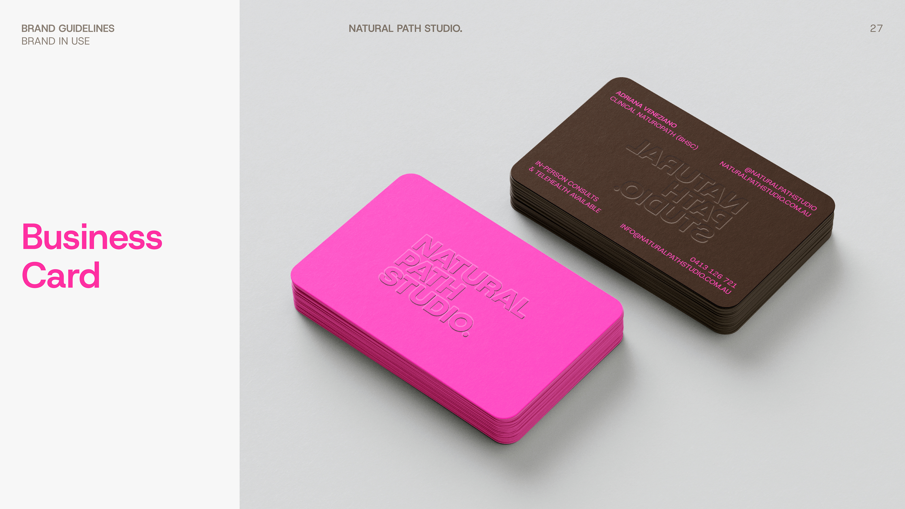
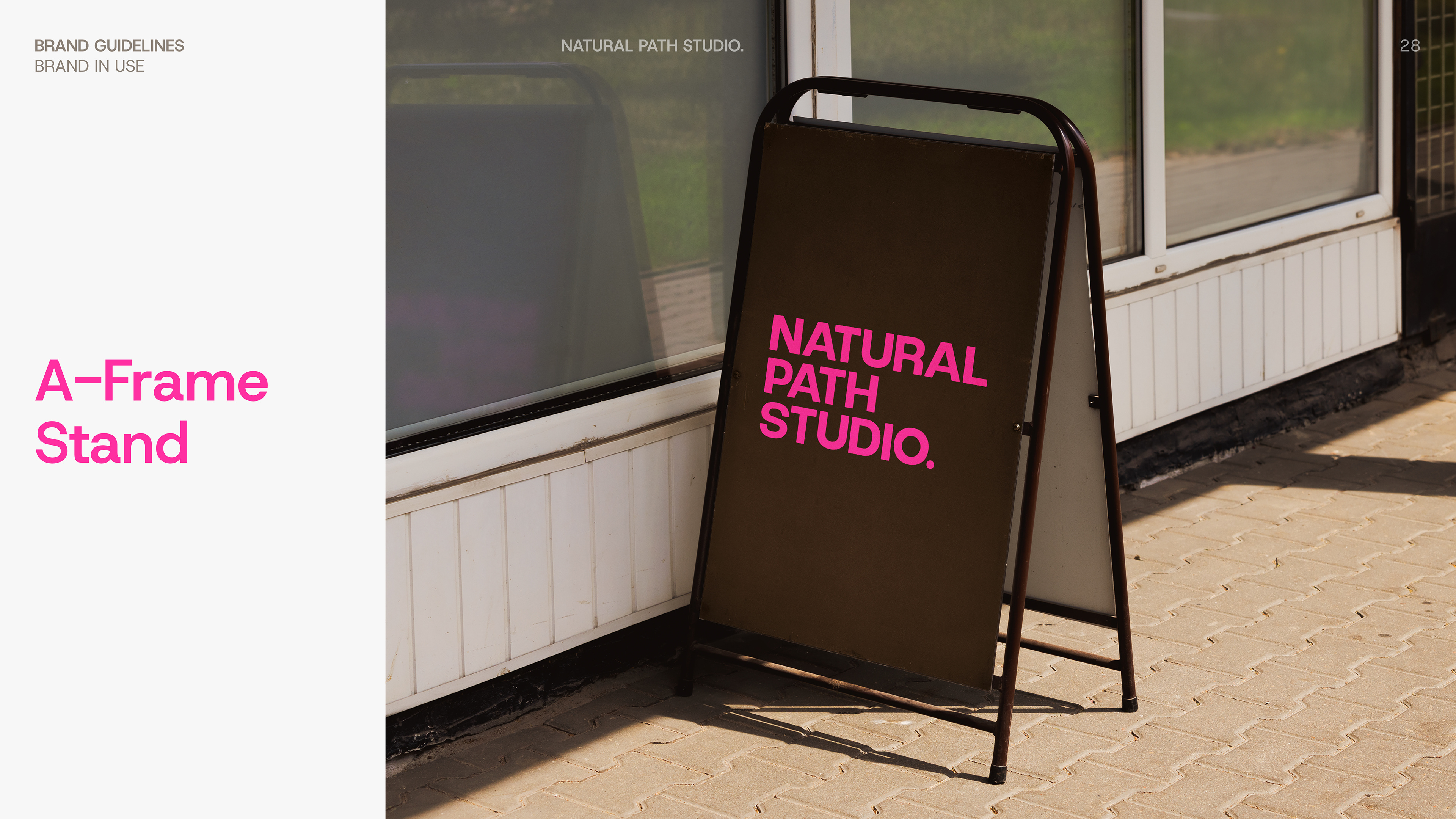
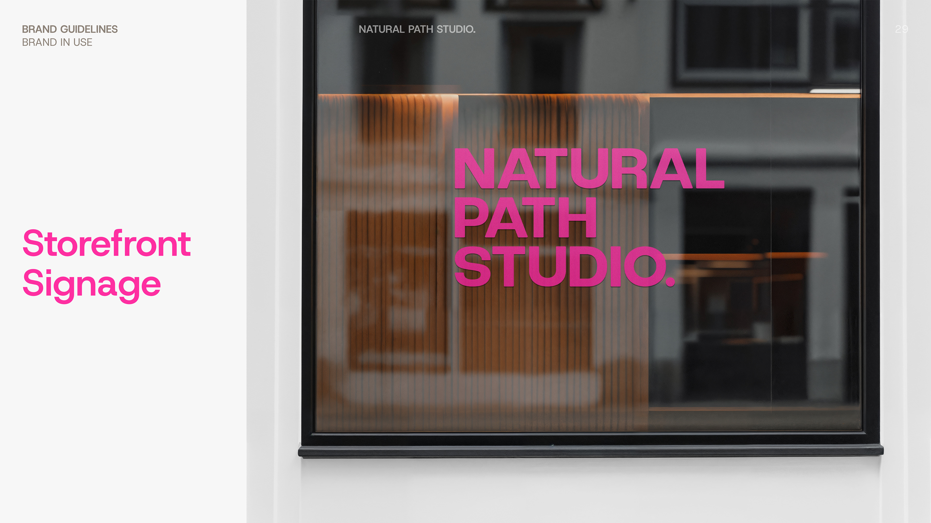
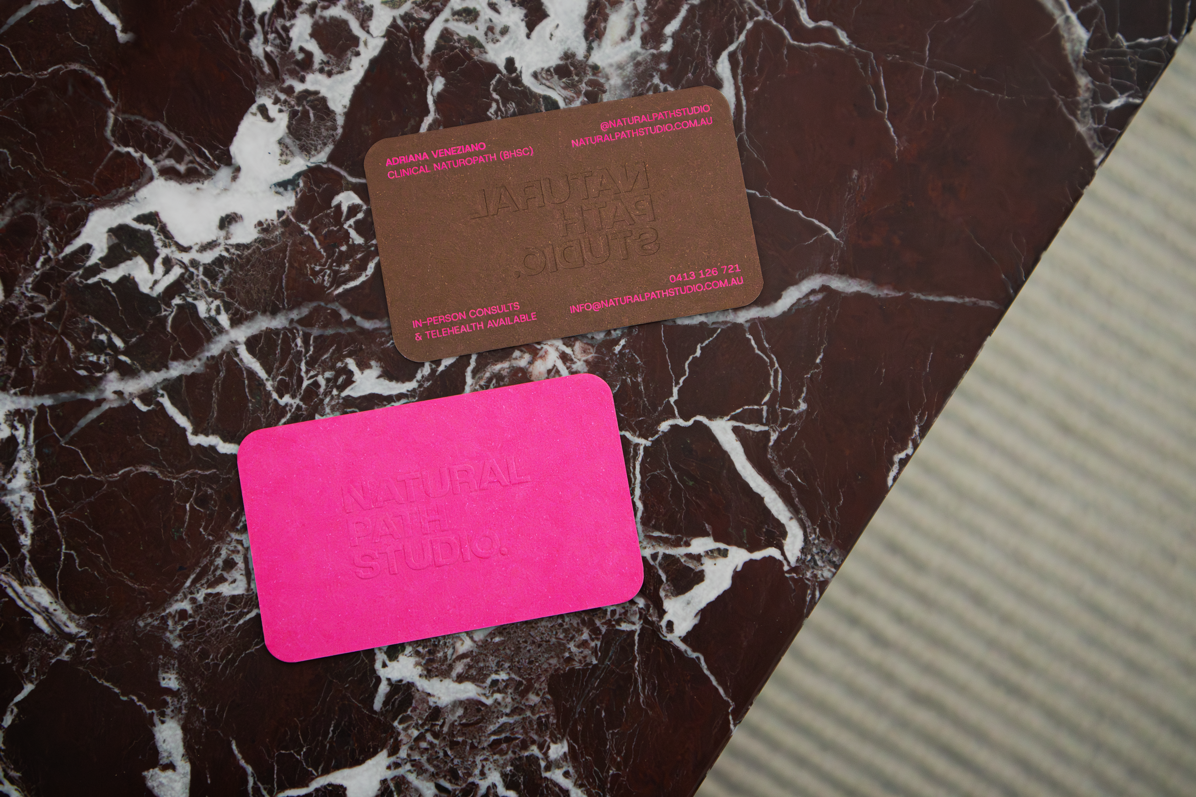
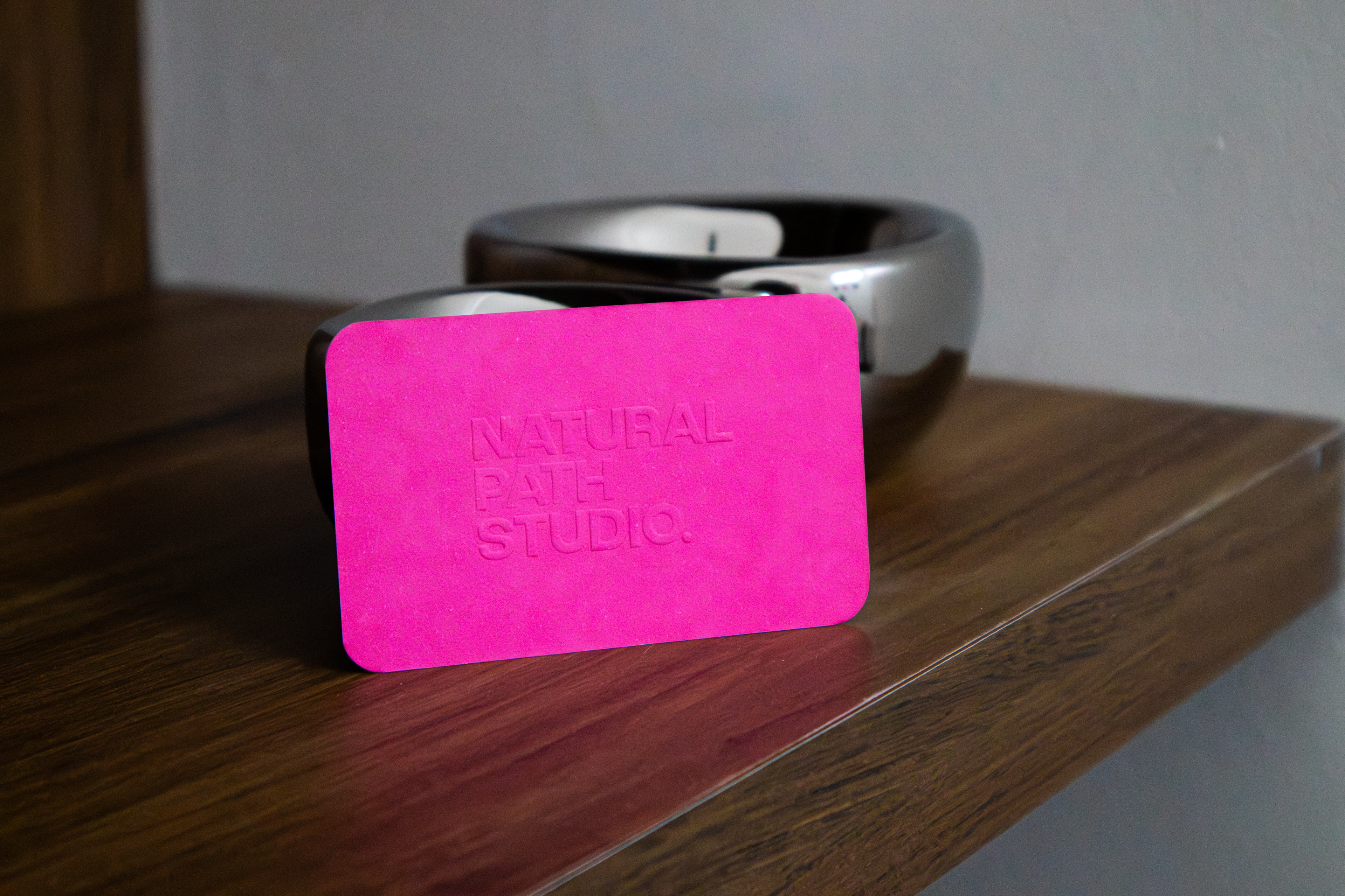
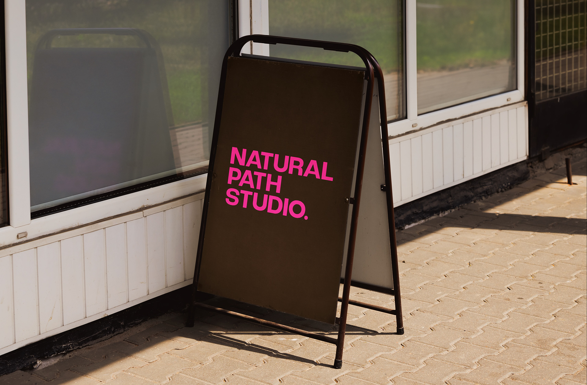
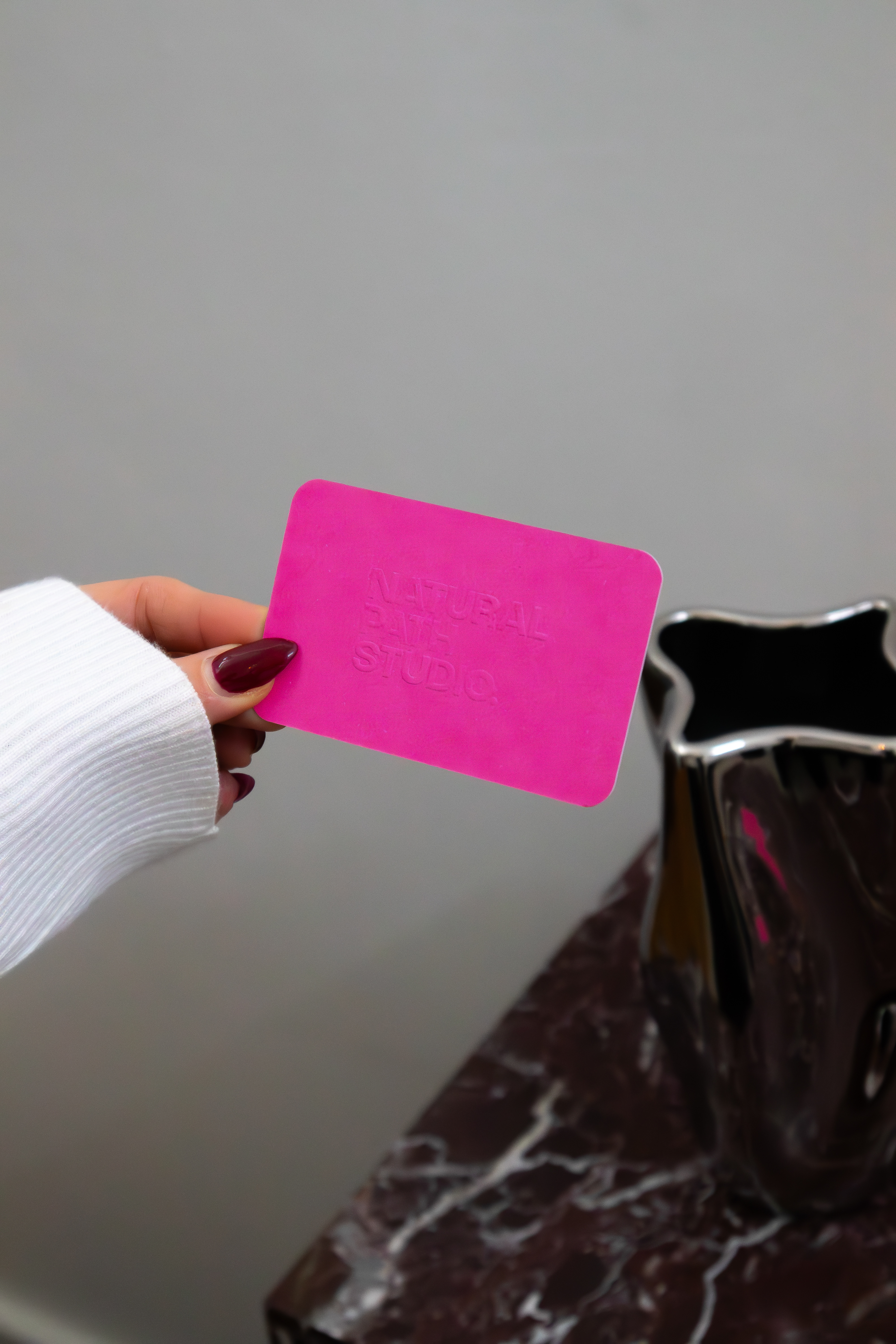
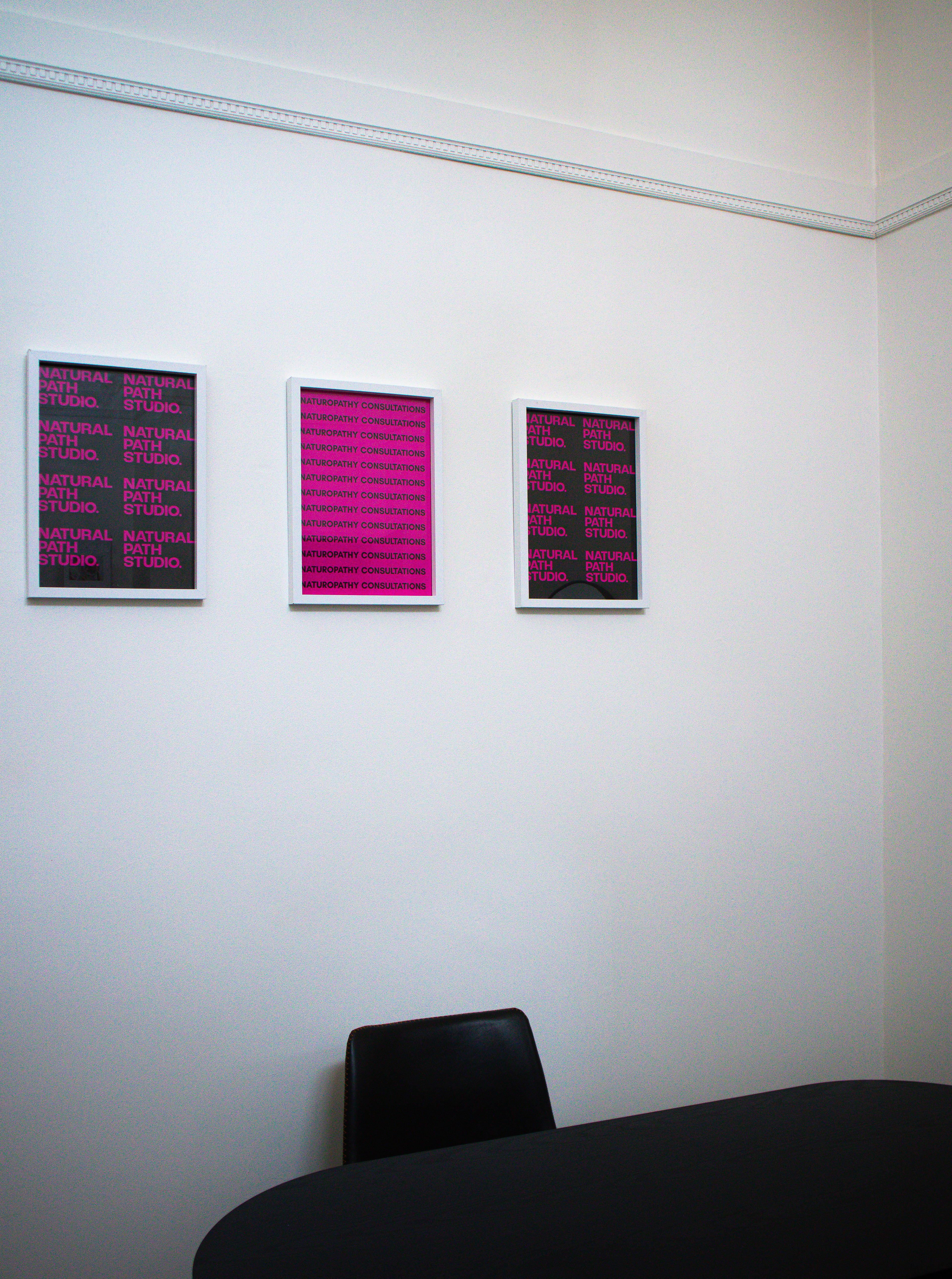
From there, the brand was brought to life across both digital and print touchpoints, creating a cohesive and adaptable system. Applications included business cards, social media graphics and a series of mockups that demonstrate the brand's potential for future growth.
The outcome? A cohesive brand identity built with intention, clarity and room to evolve.
Can clinical naturopathy be styled like a fashion feature?
DESIGN DIRECTION
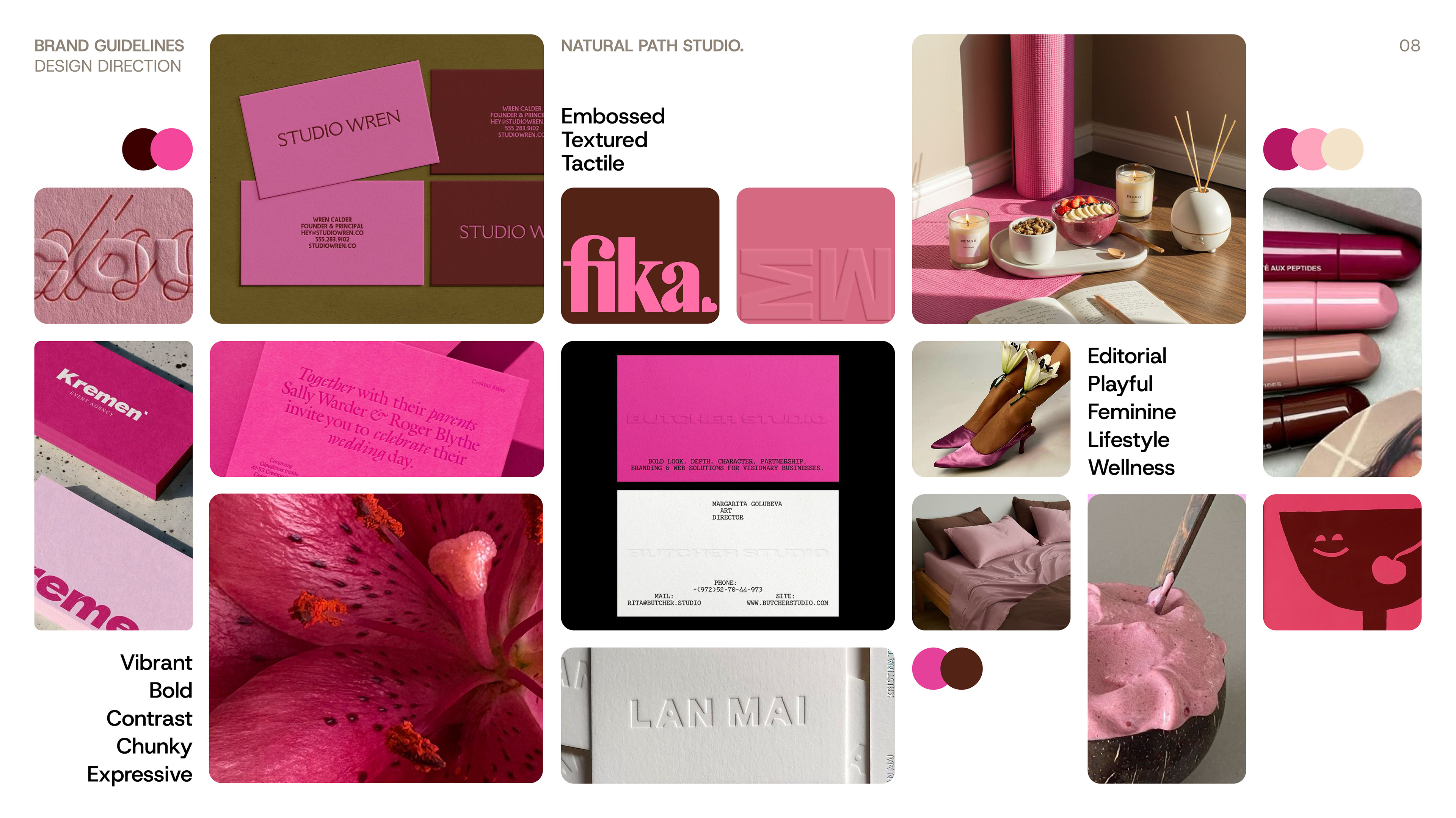
The brand direction combines an editorial, fashion-forward presence with contemporary forms, photographic art direction and a striking pink-and-brown colour contrast that feels confident, elevated and unapologetically feminine.
During the initial research phase, a series of exploratory keywords along with visual references helped define the brand language, establishing a clear look and feel that would guide the identity throughout the design process.
Editorial, Playful, Feminine, Lifestyle, Wellness, Vibrant, Bold, Expressive, Contrast, Chunky, Textured, Tactile, Embossed.
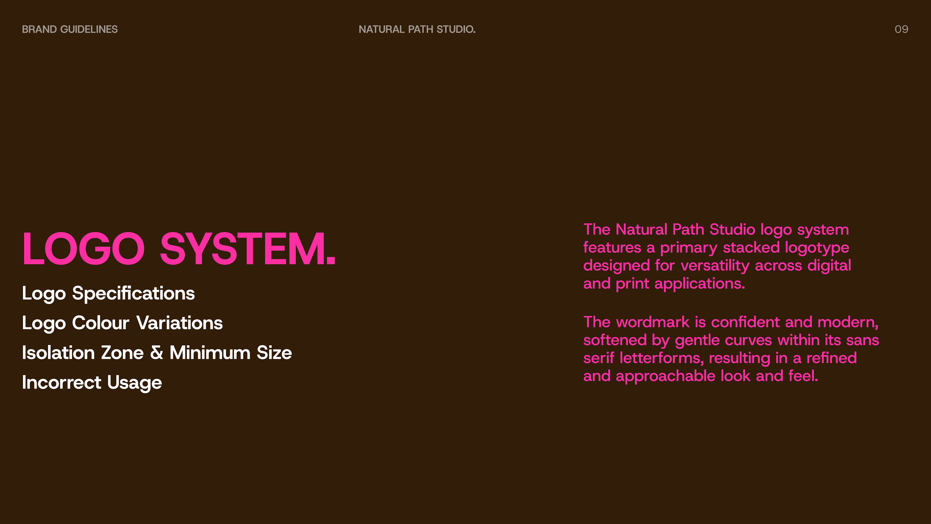
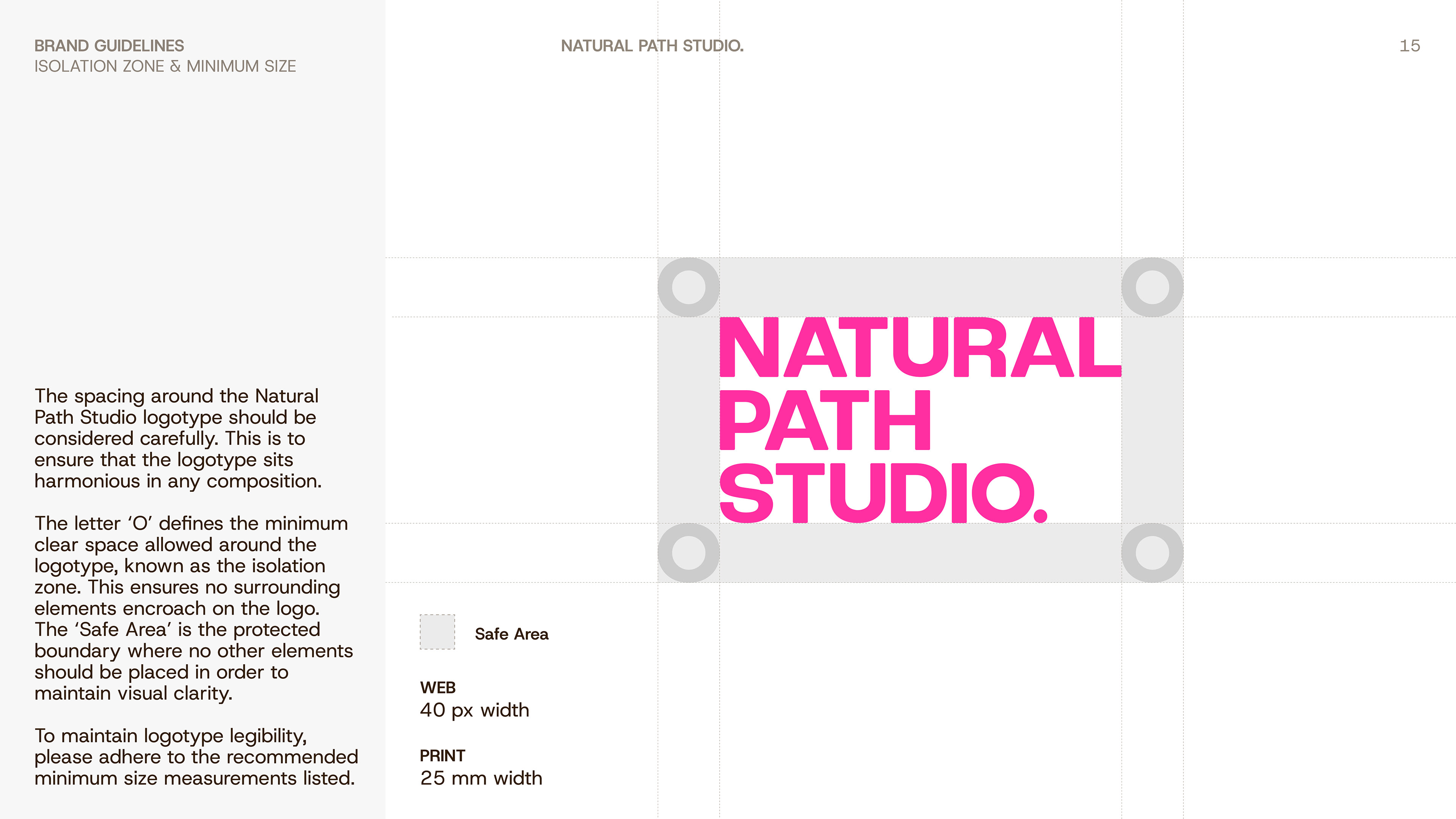
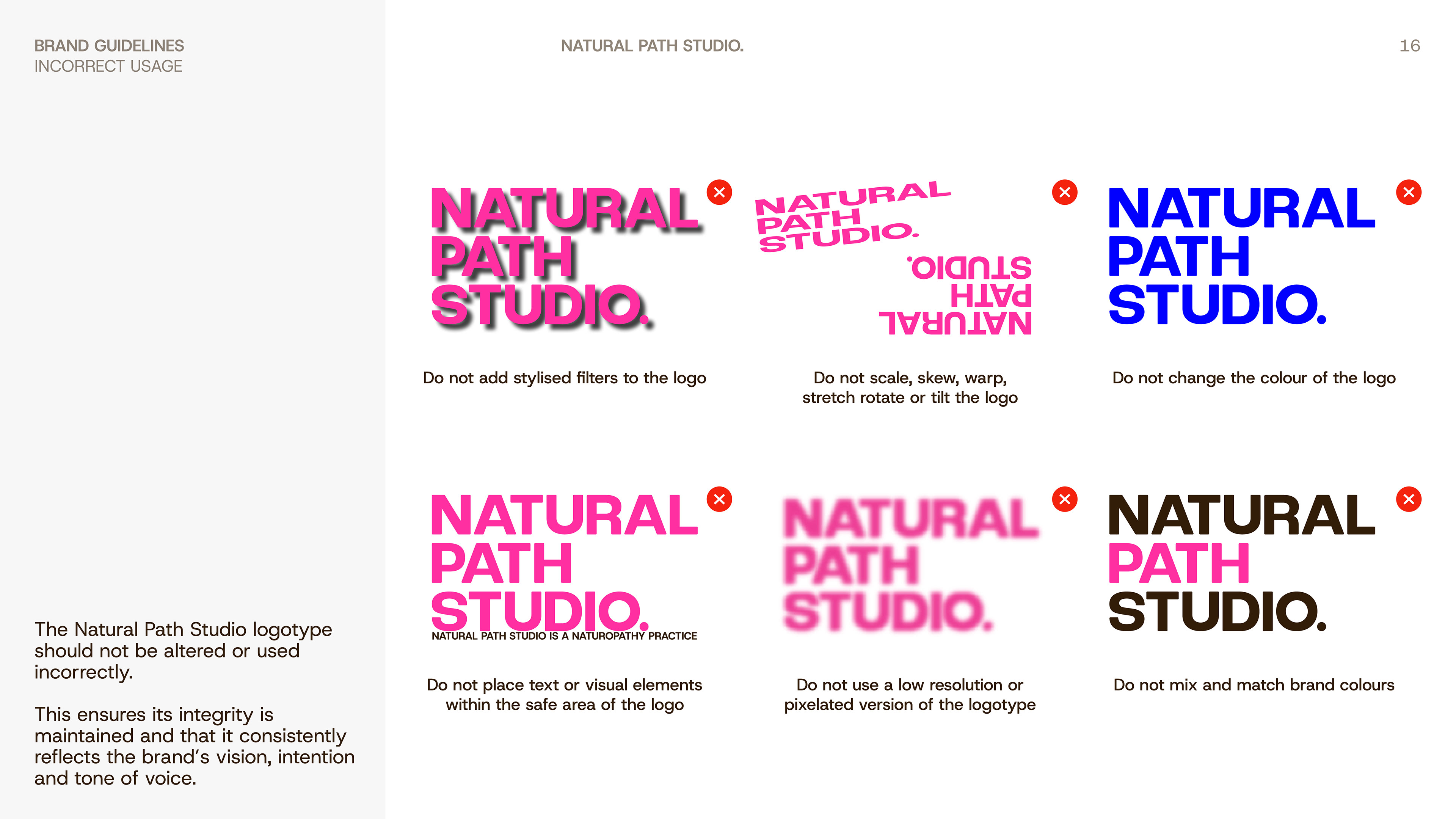
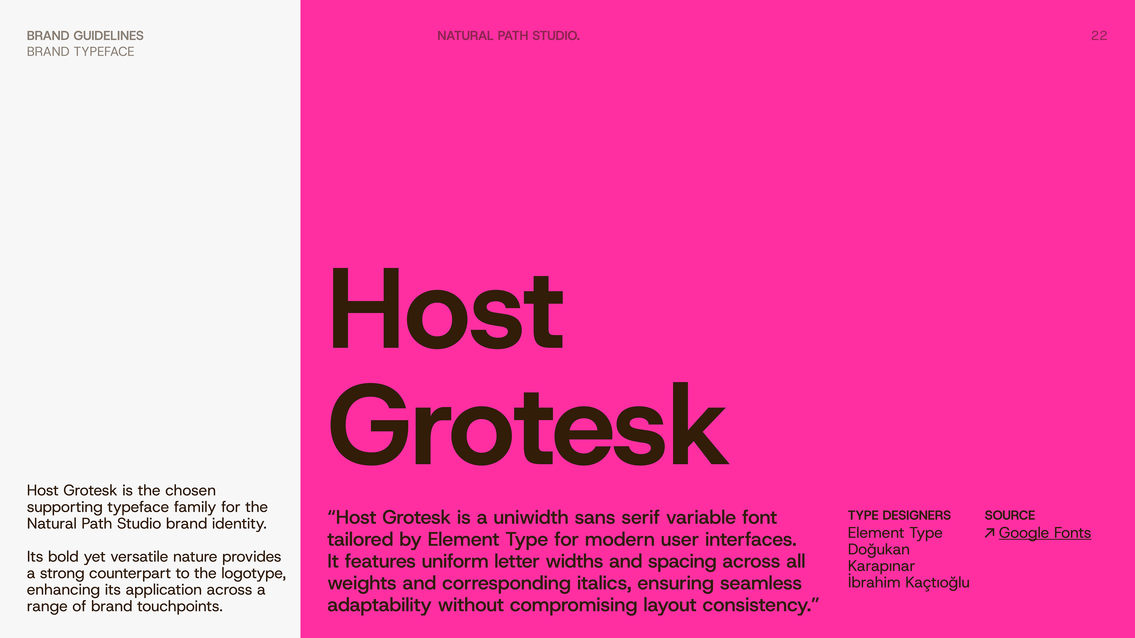
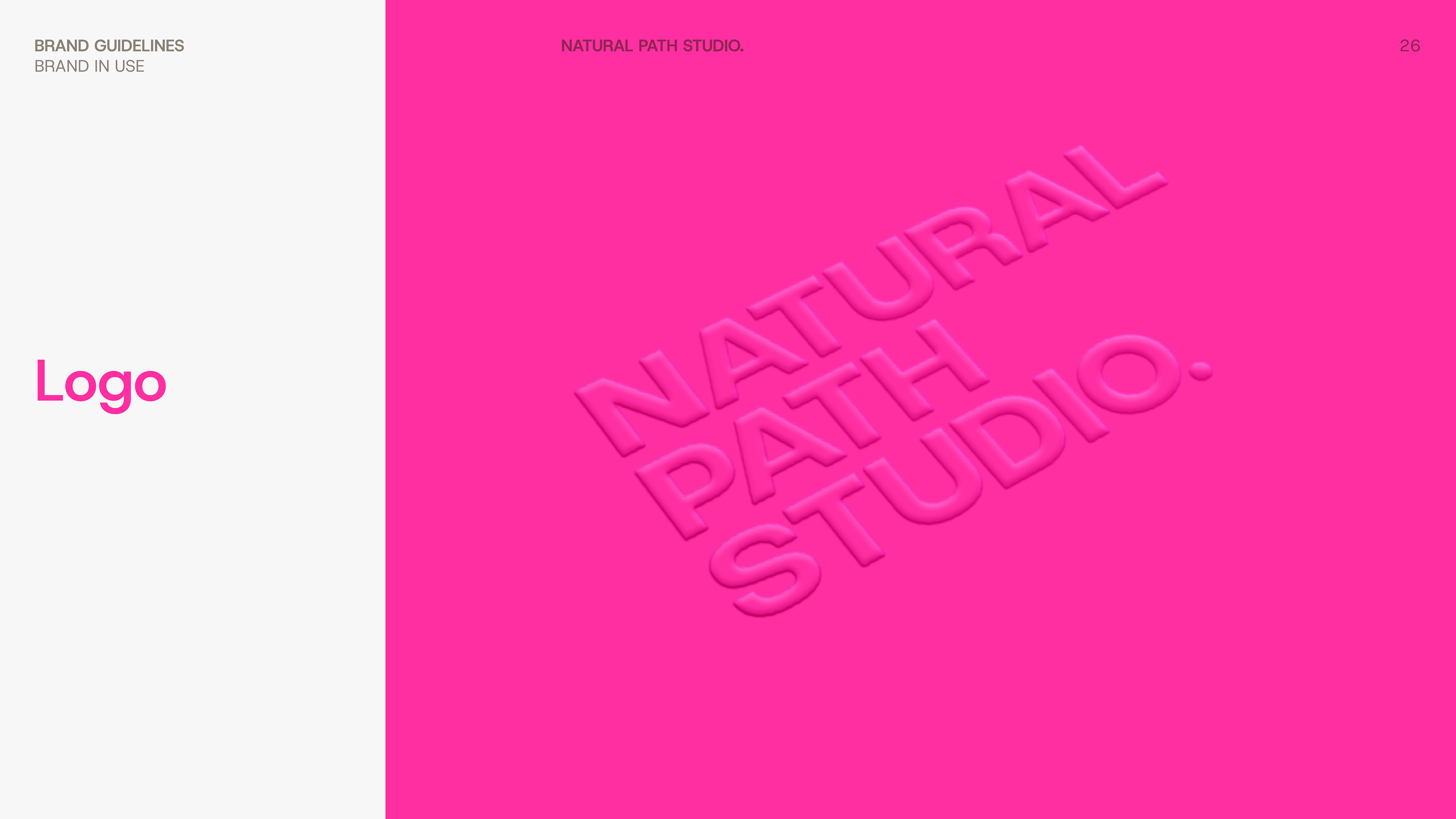
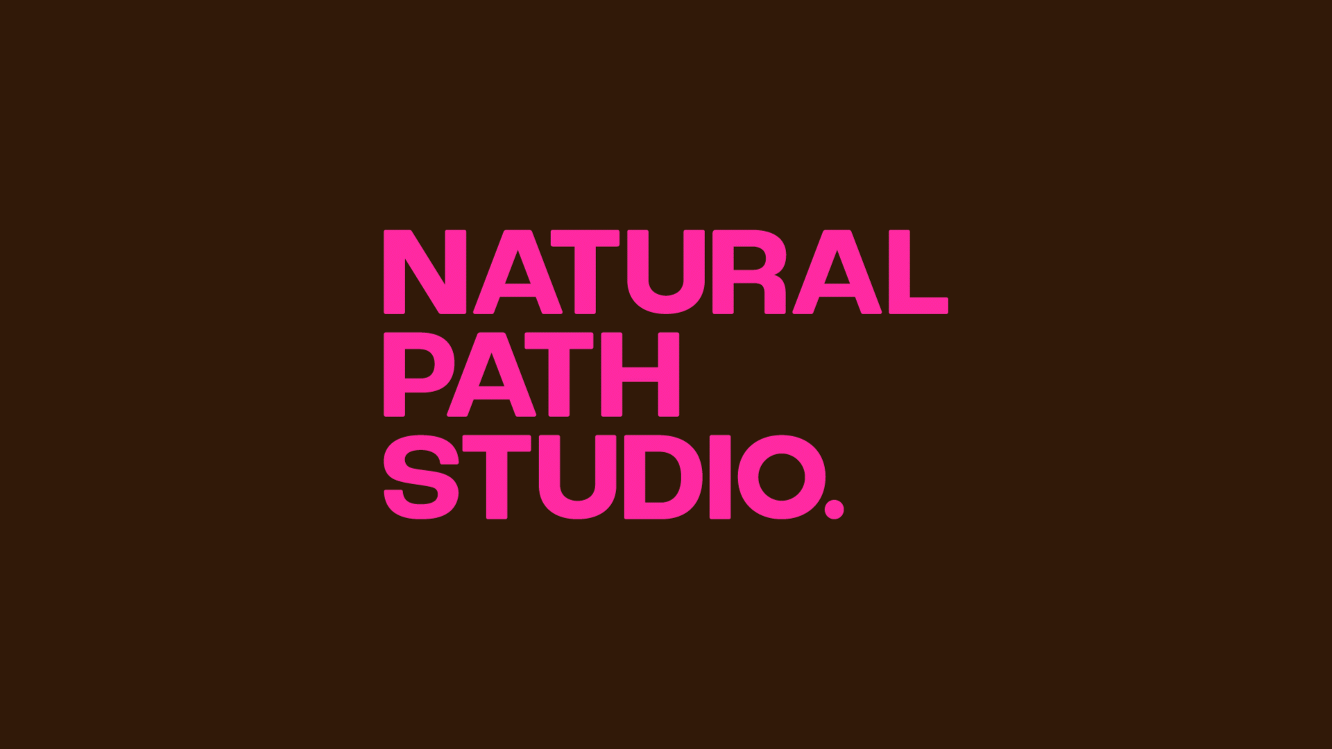
The Logotype
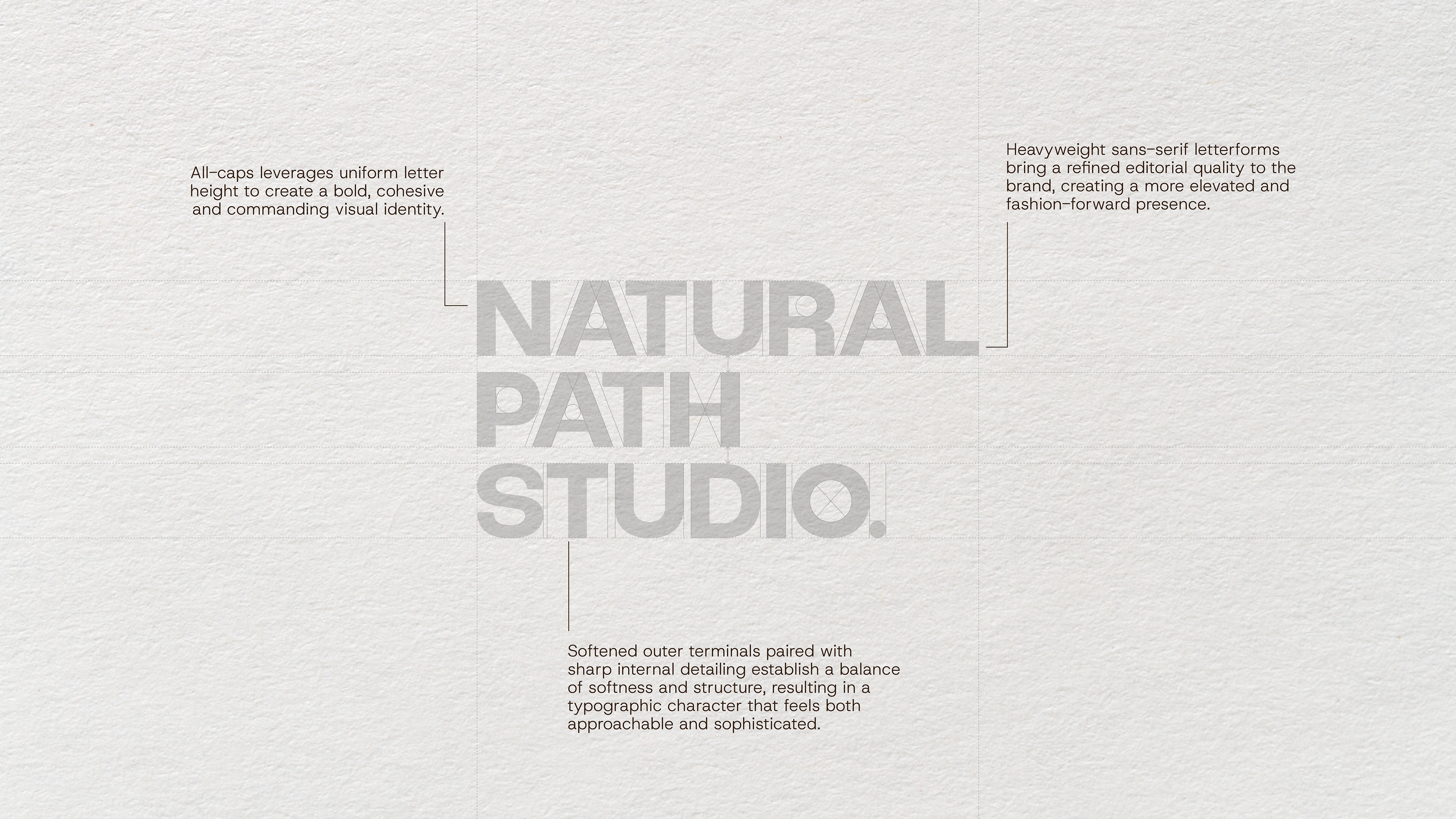
DESIGNING THE LETTERMARK
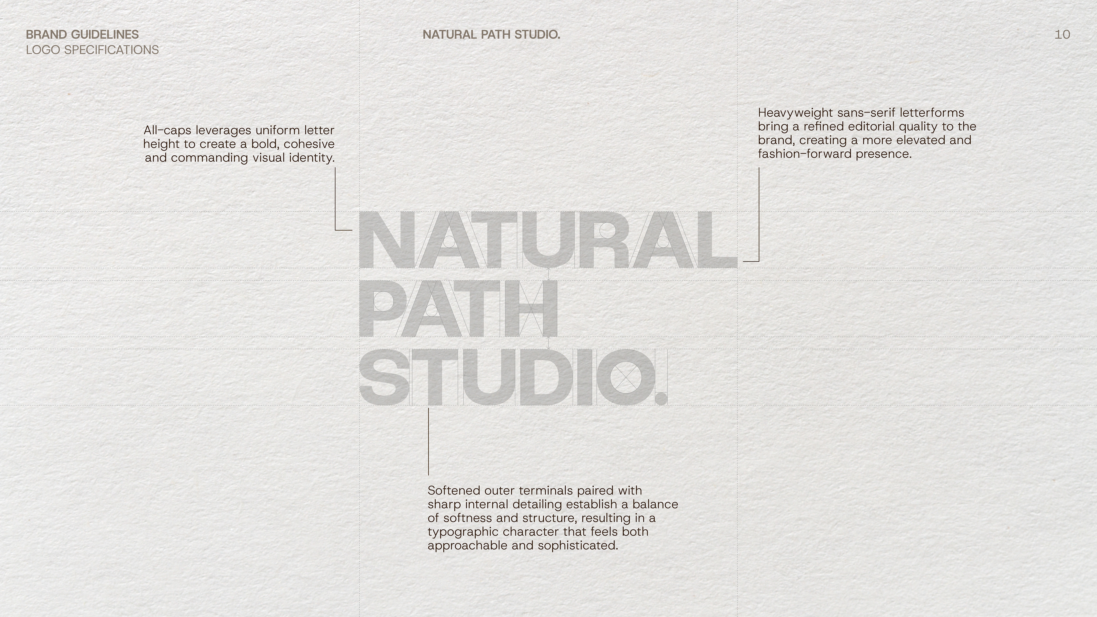
The development of the lettermark marked the first step in building out the broader identity system. Guided by the client's desire for a modern, letter-driven and editorial-inspired mark, the design process focused on creating a distinctive typographic form that felt both contemporary and refined.
Drawing influence from magazine mastheads, the lettermark combines tight kerning, stacked typography, confident capital letterforms and subtly softened edges to create a refined yet approachable foundation for the brand.
The Colour Story
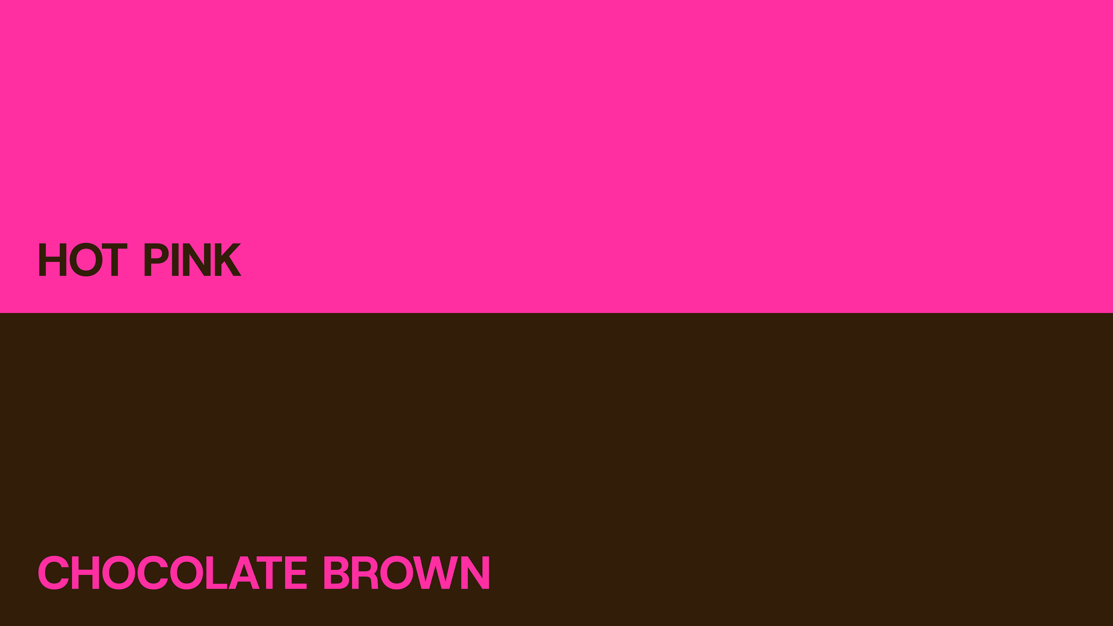
Building the Palette
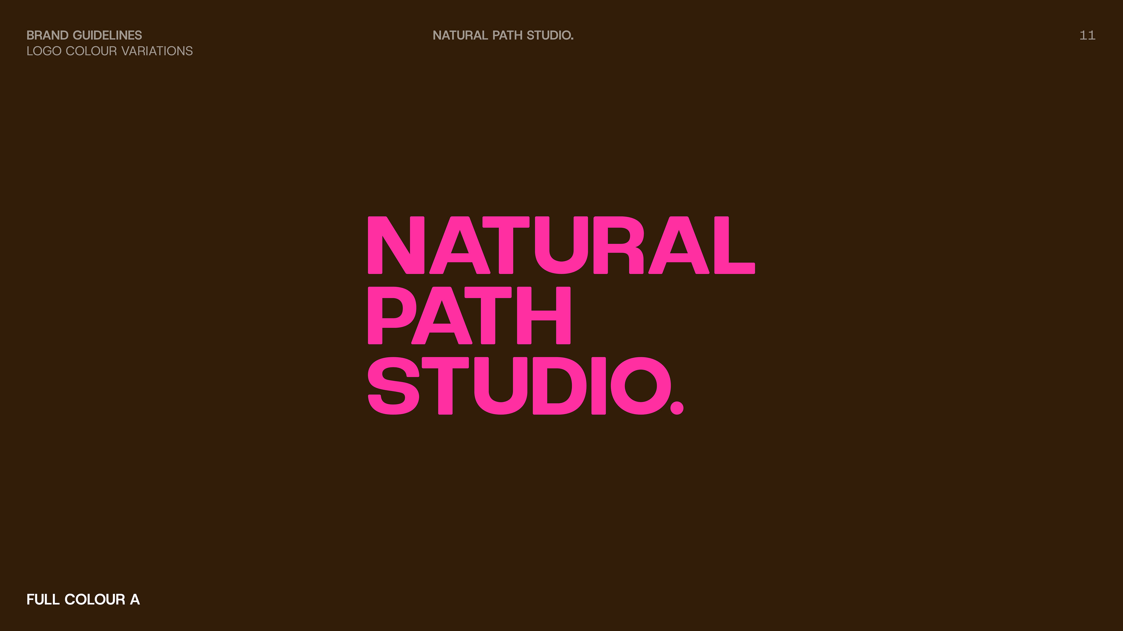
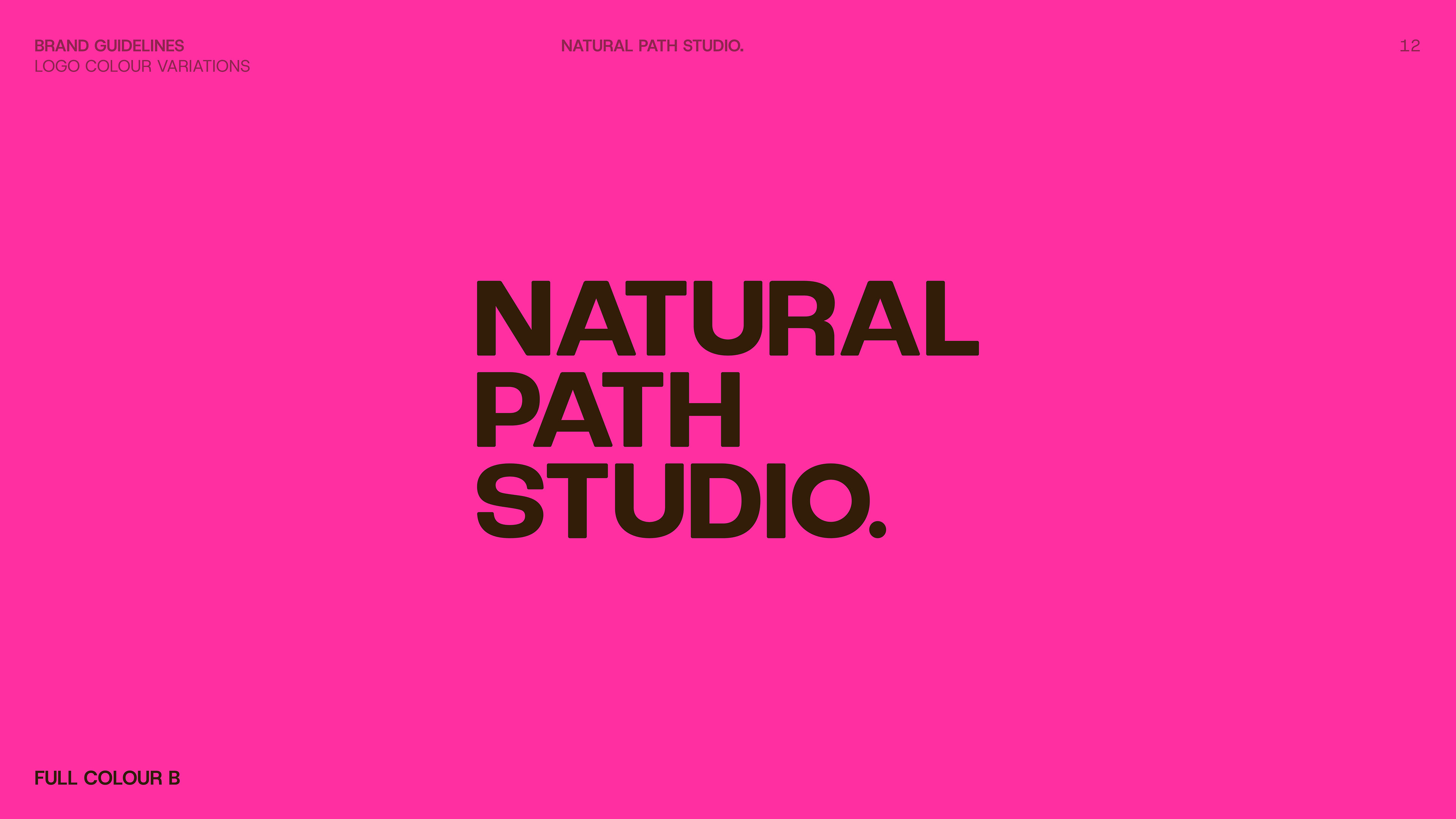
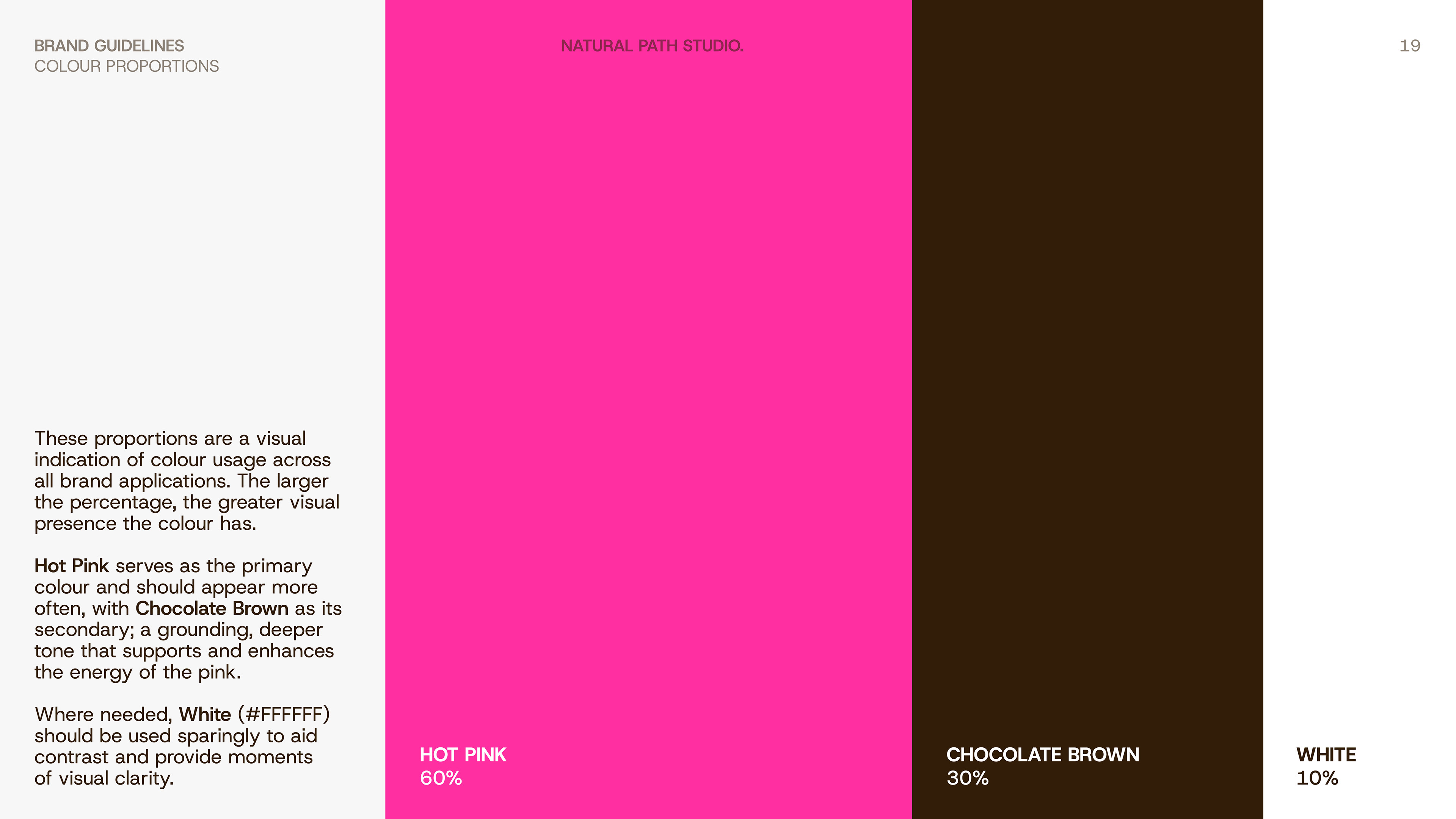
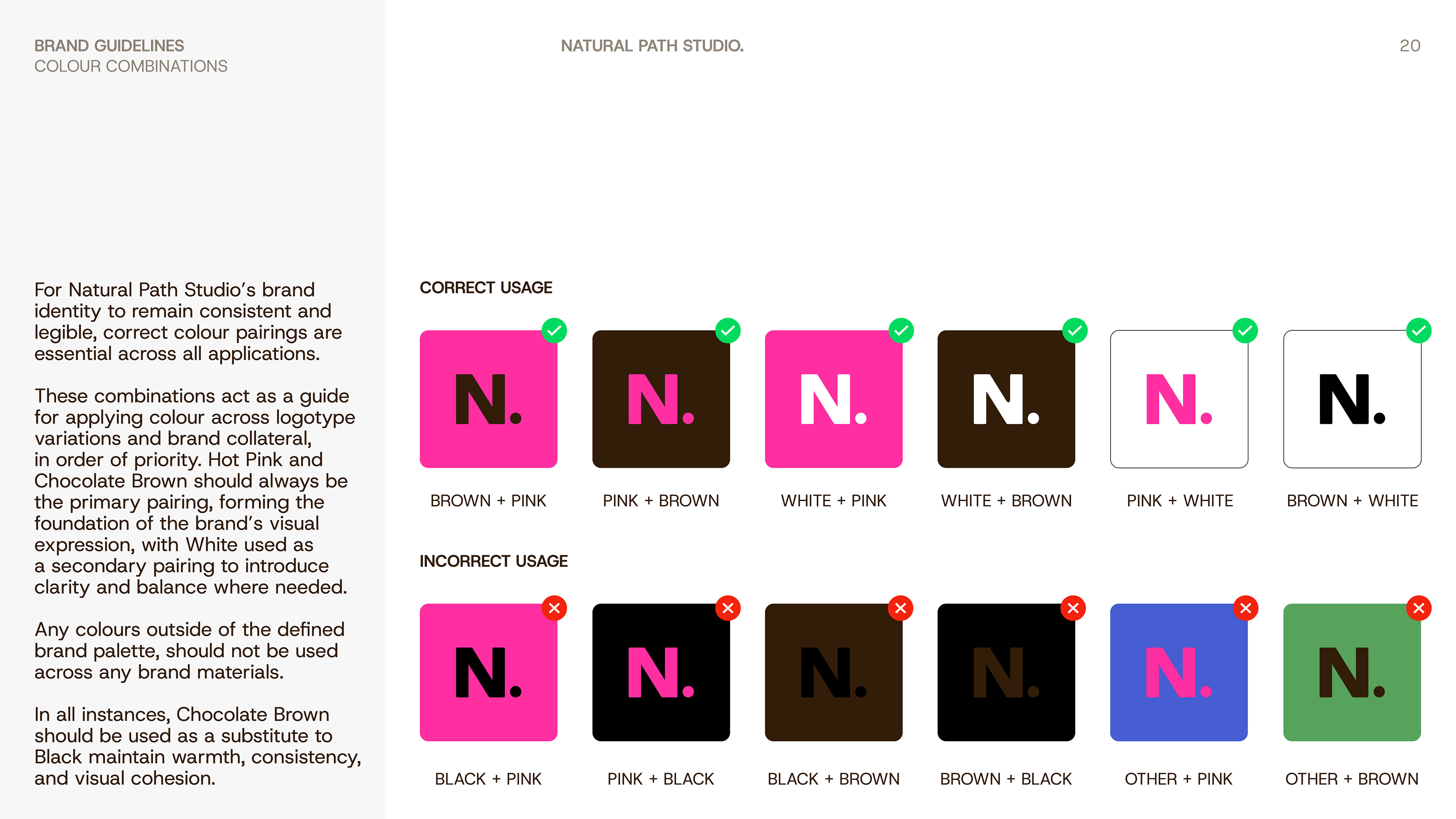
Centred around a vibrant pink and rich brown, the colour story was designed to create immediate visual impact, drawing subtle reference to the balance of energy and grounded care central to naturopathic practice.
The high-contrast pairing becomes a defining element of the identity, shaping personality and strengthening recognition across the wider system.
CORE VALUES
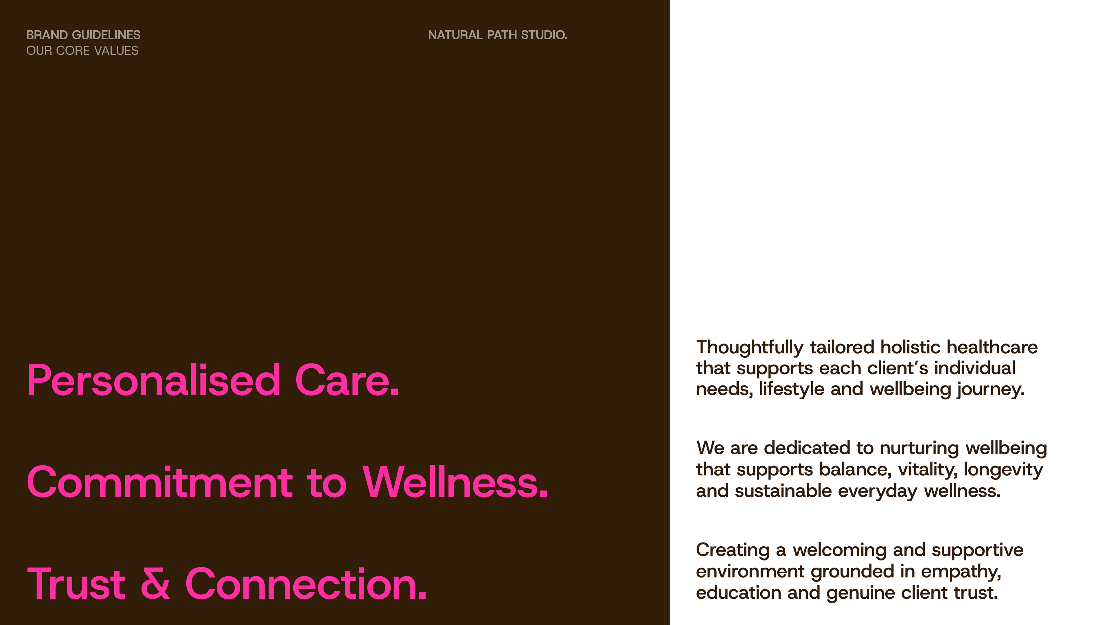
Personalised Care.
Thoughtfully tailored holistic healthcare that supports each client’s individual needs, lifestyle and wellbeing journey.
Commitment to Wellness.
Natural Path Studio is dedicated to nurturing wellbeing that supports balance, vitality, longevity and sustainable everyday wellness.
Trust & Connection.
Creating a welcoming and supportive environment grounded in empathy, education and genuine client trust.
Brand Guidelines