Fit with Fran
Brand Identity
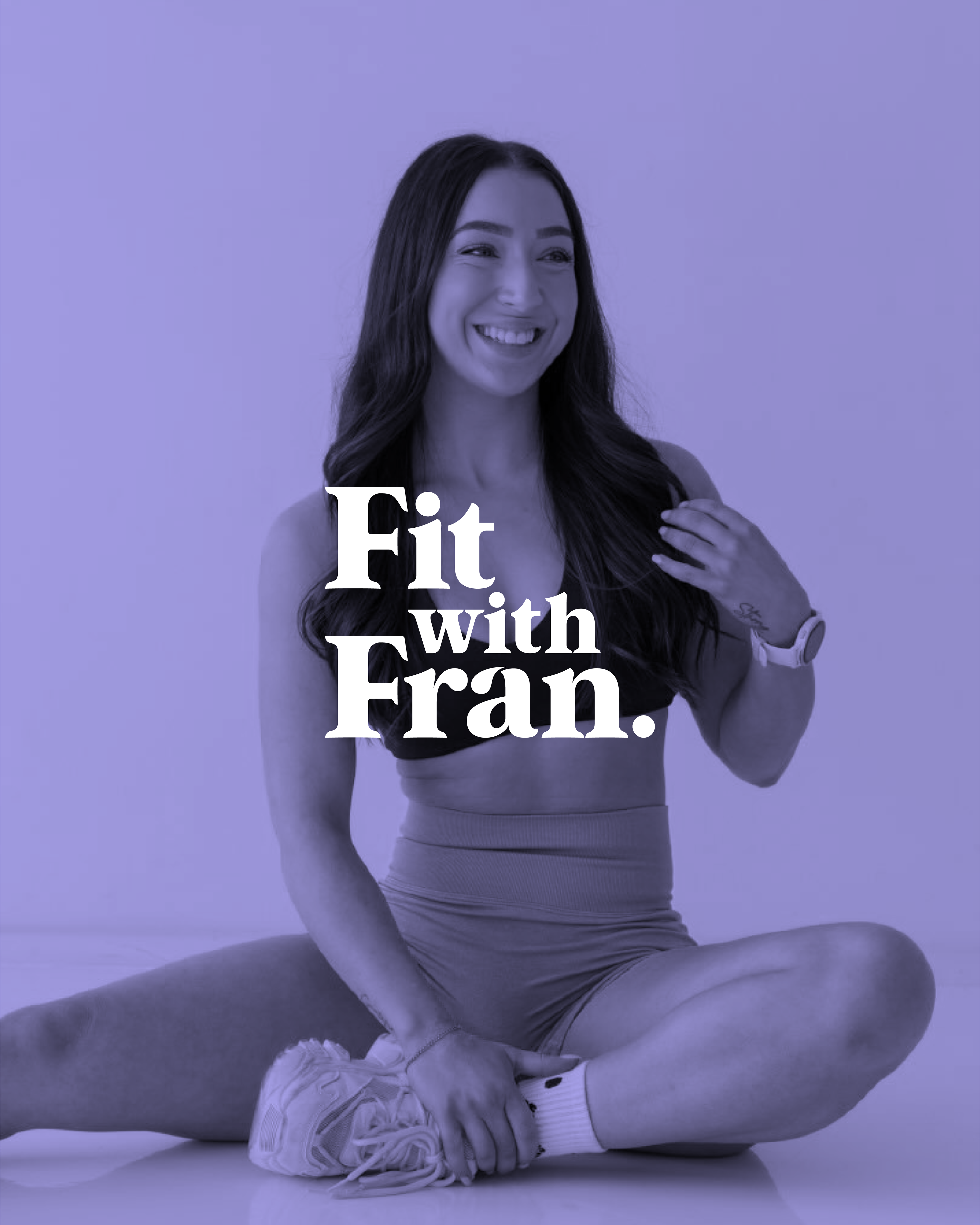
Through personalized coaching, Fran is building a community where women feel strong, capable, and confident.
A brand refresh was essential to align with Fit with Fran's evolving values and expanding audience.
Since the original brandmark was created in 2021, Fit with Fran has grown significantly, prompting a brand refresh to better reflect its evolving values and audience. The updated identity is grounded in Fran’s mission to empower women, capturing a sense of strength, confidence and community that speaks more deeply to her expanding audience.
A WORD From the client
"I have worked with Lauren twice now, initially a few years ago, to design a logo for my business. We collaborated again to rebrand my business, and there is no one else I would trust or want to work with more.
Lauren’s communication and systems made the whole design process so smooth from the initial consult to the final product. She ensures everything is mapped out clearly and she spares no detail in every step.
I felt so at ease working with her on something so important to me, and on both occasions, she not only brought my vision to life but exceeded every expectation I had. I cannot speak highly enough of her and her talent."
Evolving an Established Brand
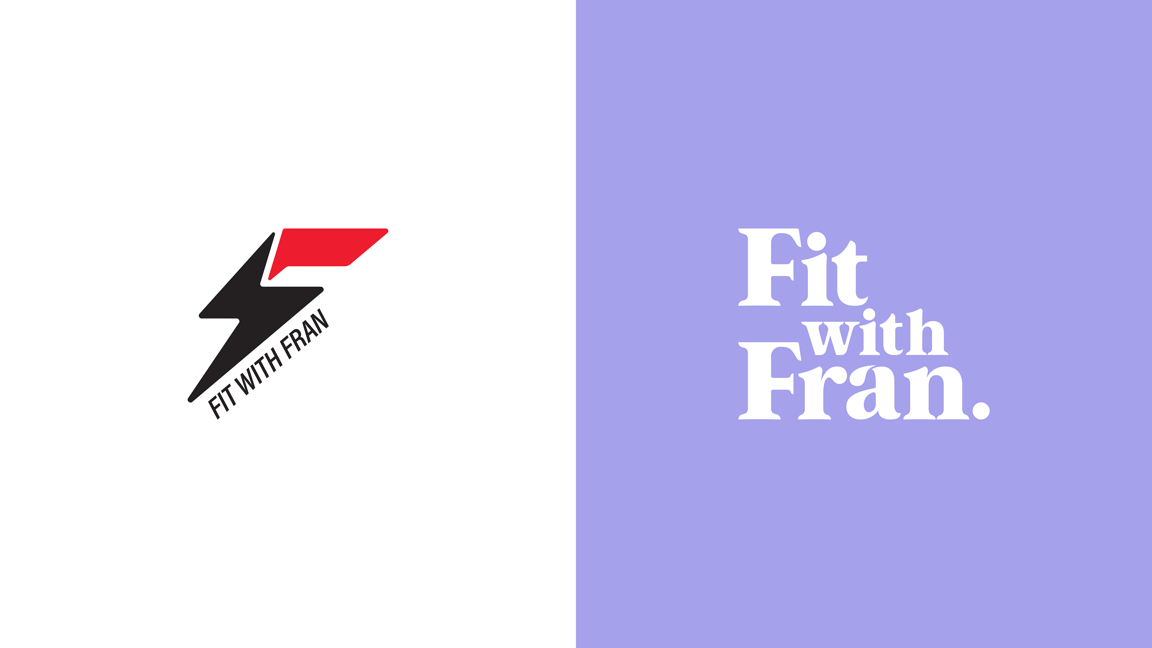
Same foundation, sharper direction
A brand refresh isn’t about starting over. It’s about evolving what already exists with intention.
The challenge was to build on the established foundations of Fit with Fran, identifying what was already working and where refinement was needed.
Through research and collaboration, the focus shifted toward strengthening the connection with a more tailored audience, rather than chasing broad, mass-market appeal, while positioning the brand's visuals to promote growth, longevity, and a new chapter of relevance.
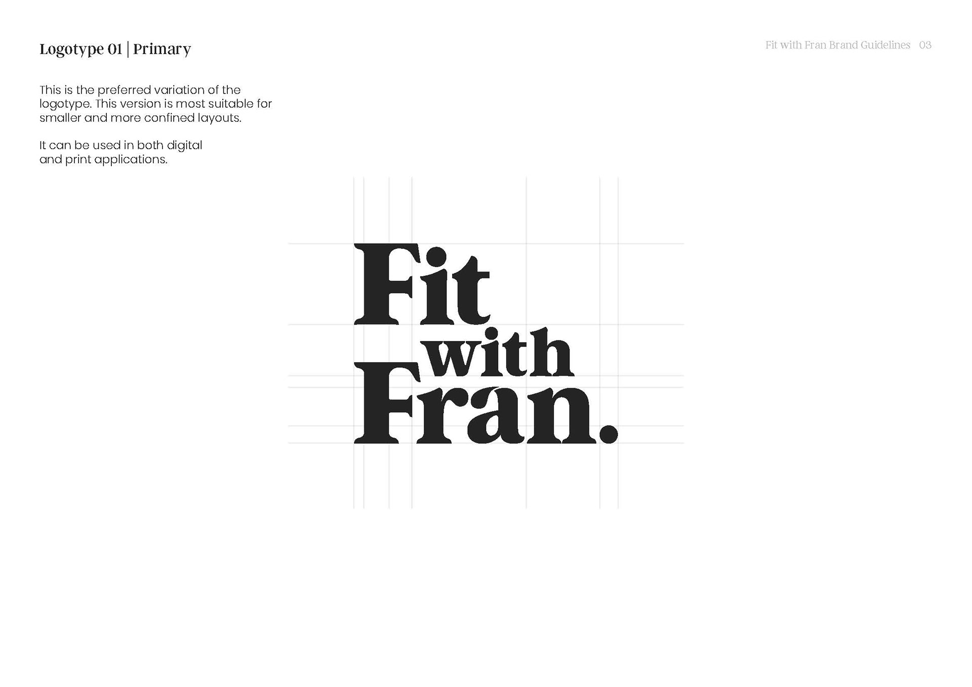
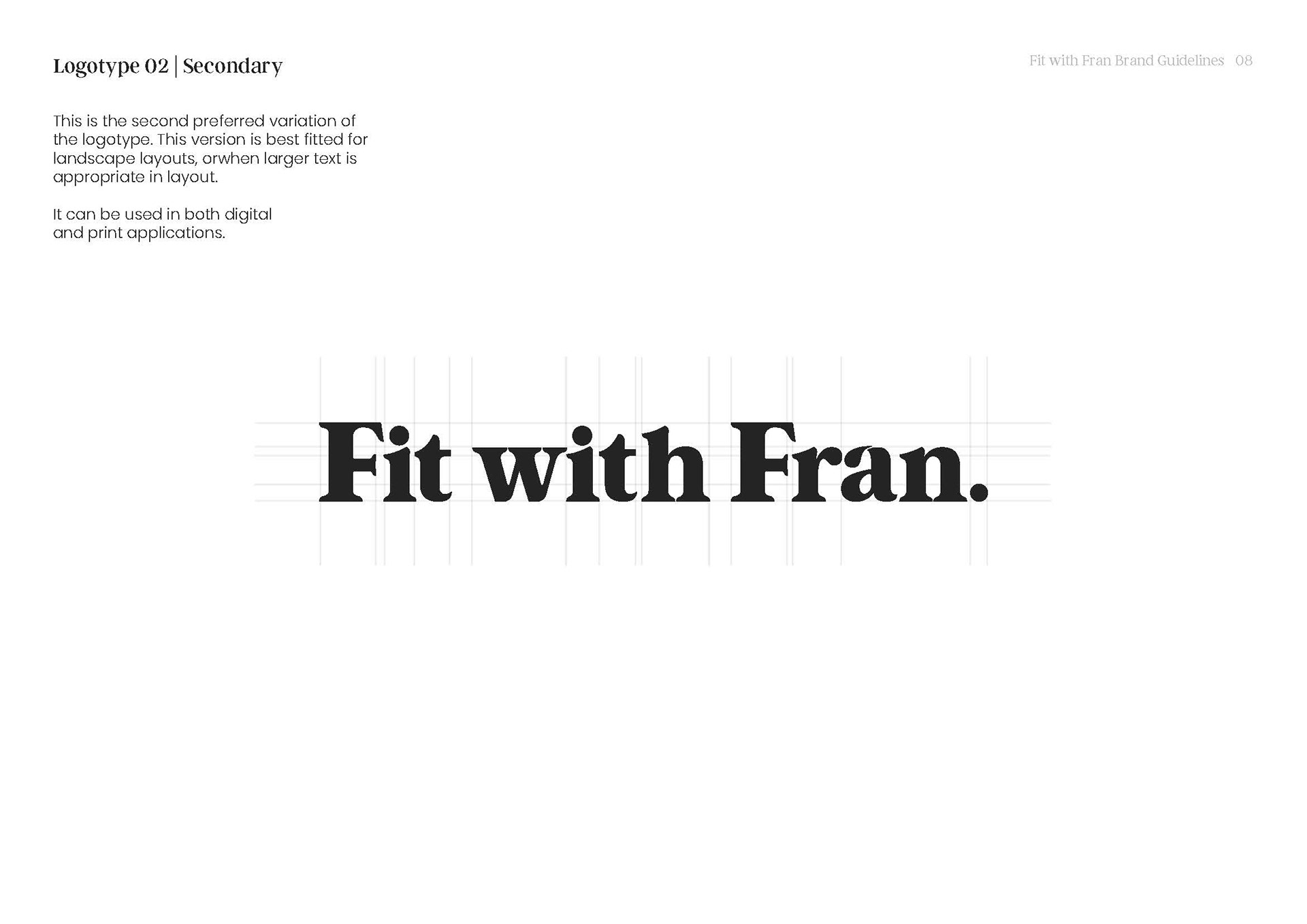
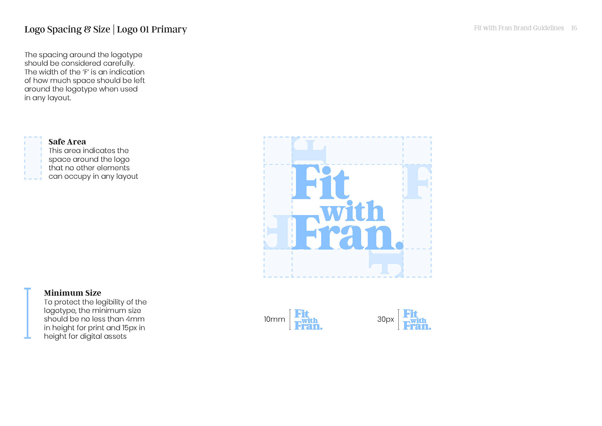
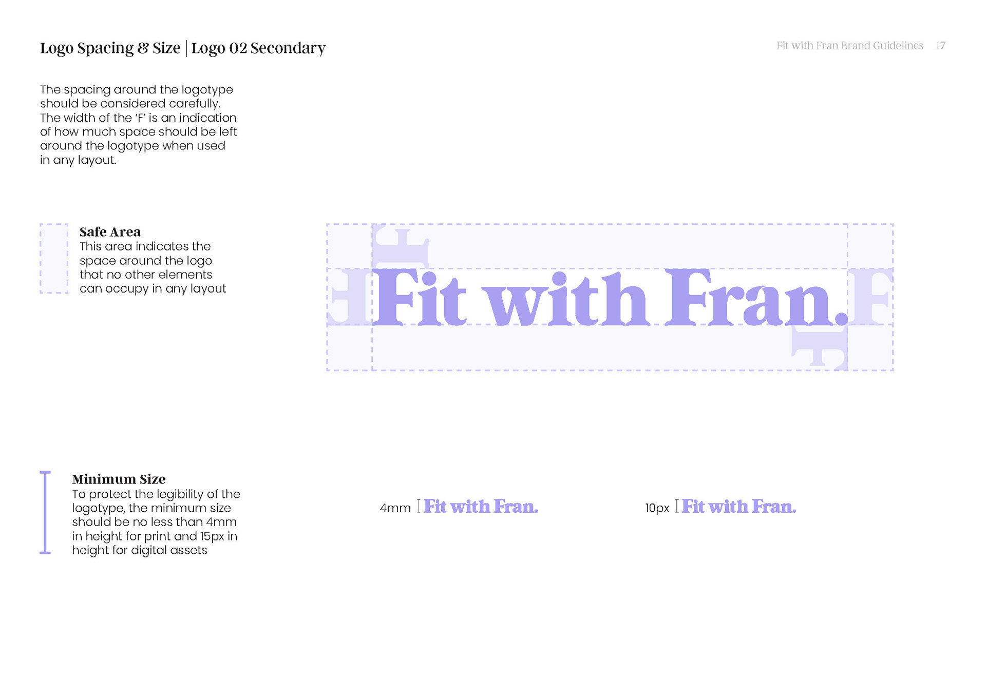
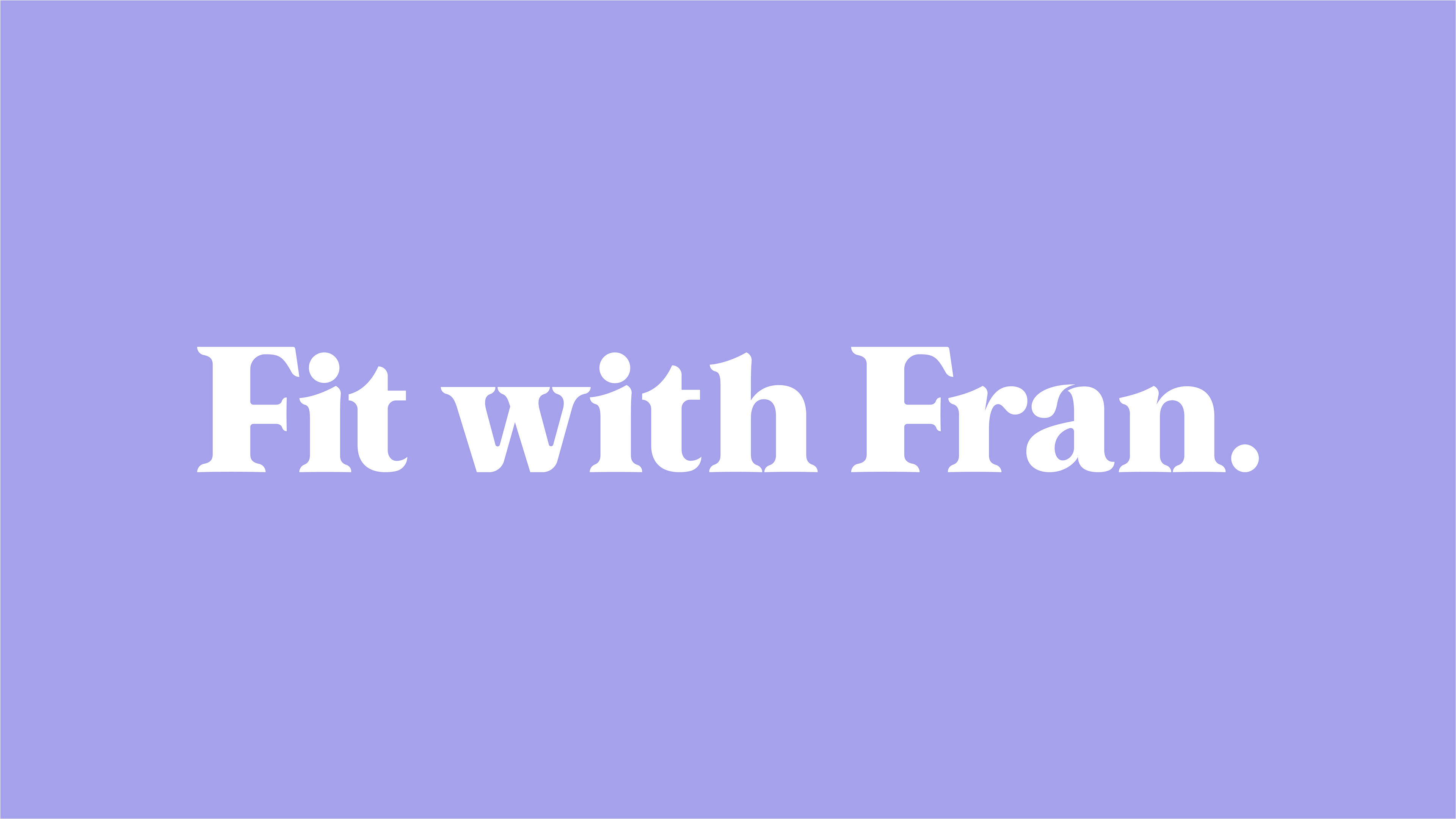
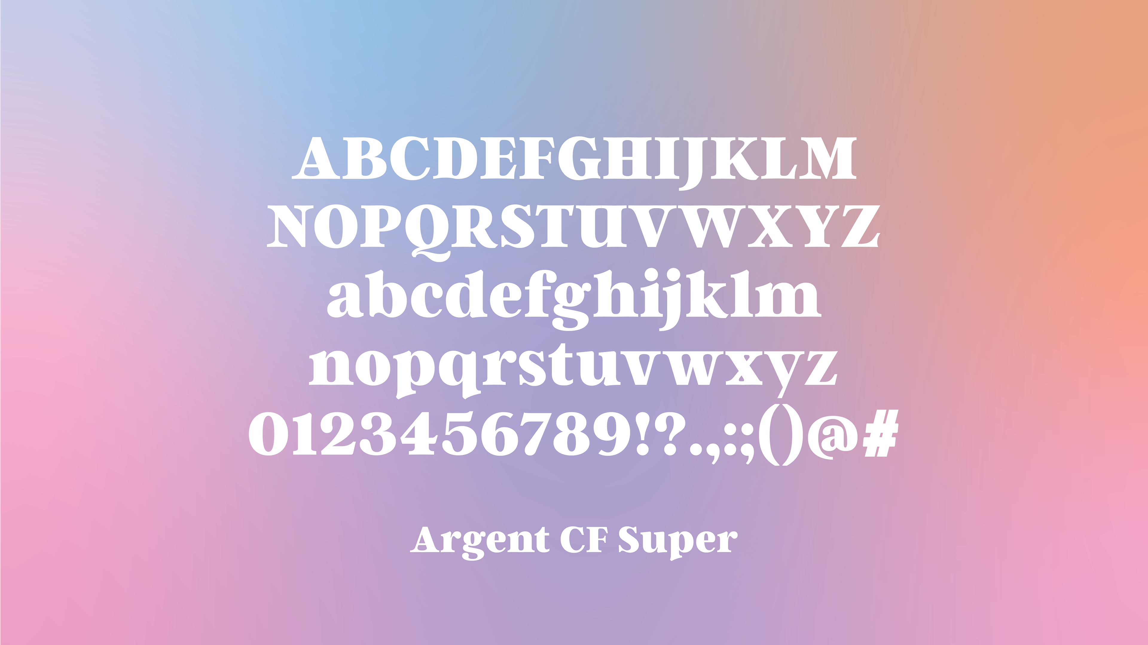
A structured yet expressive wordmark system
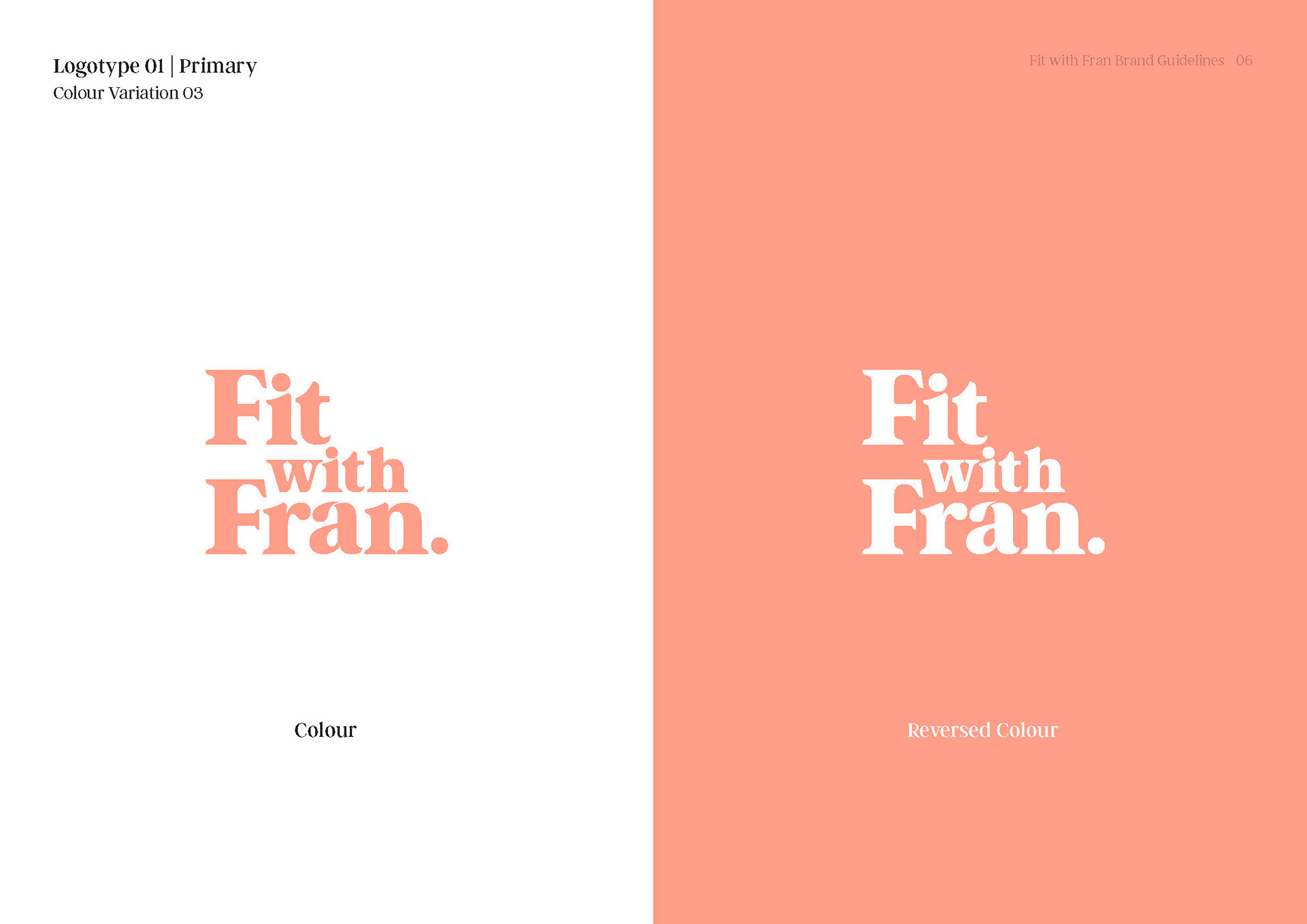
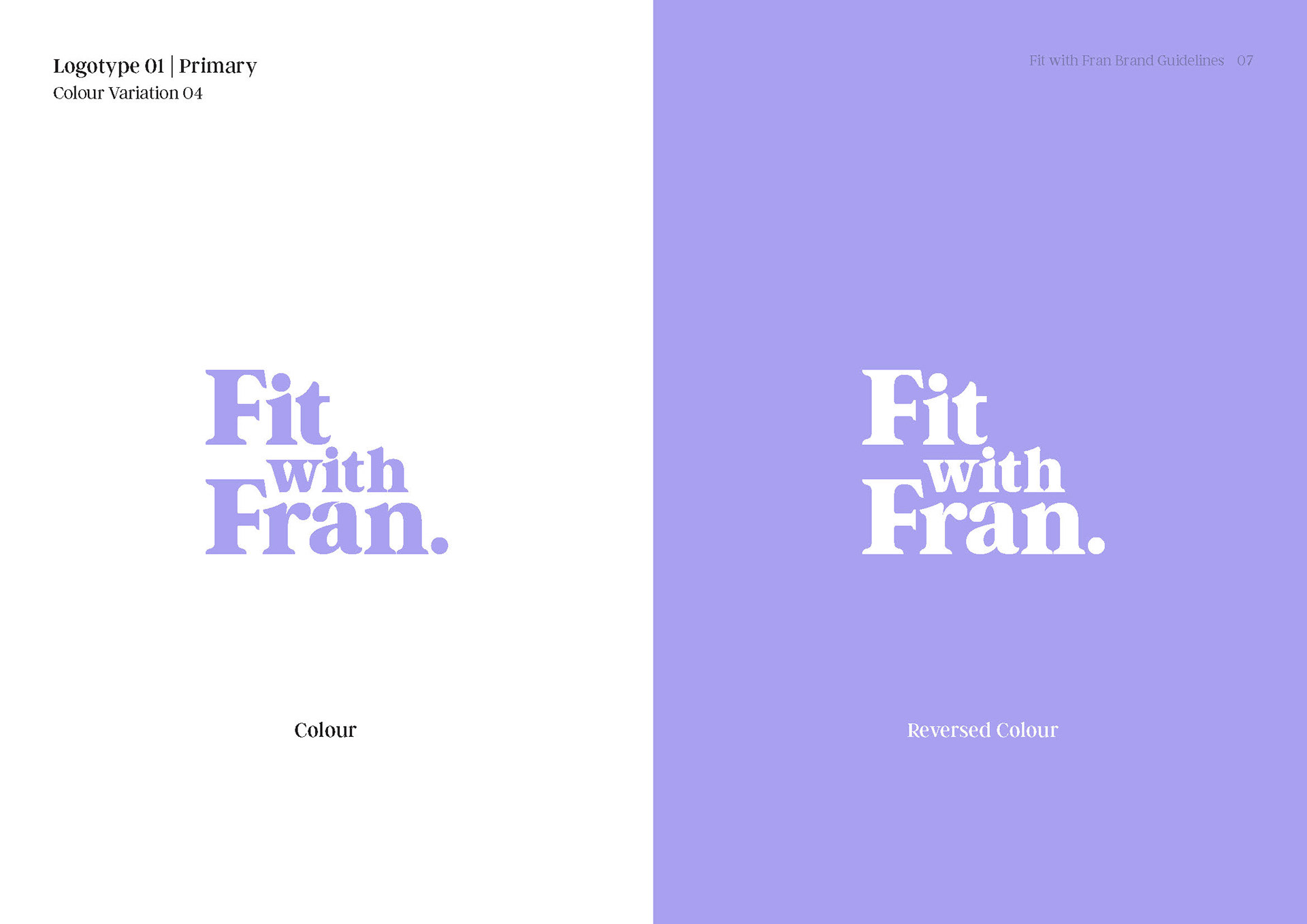
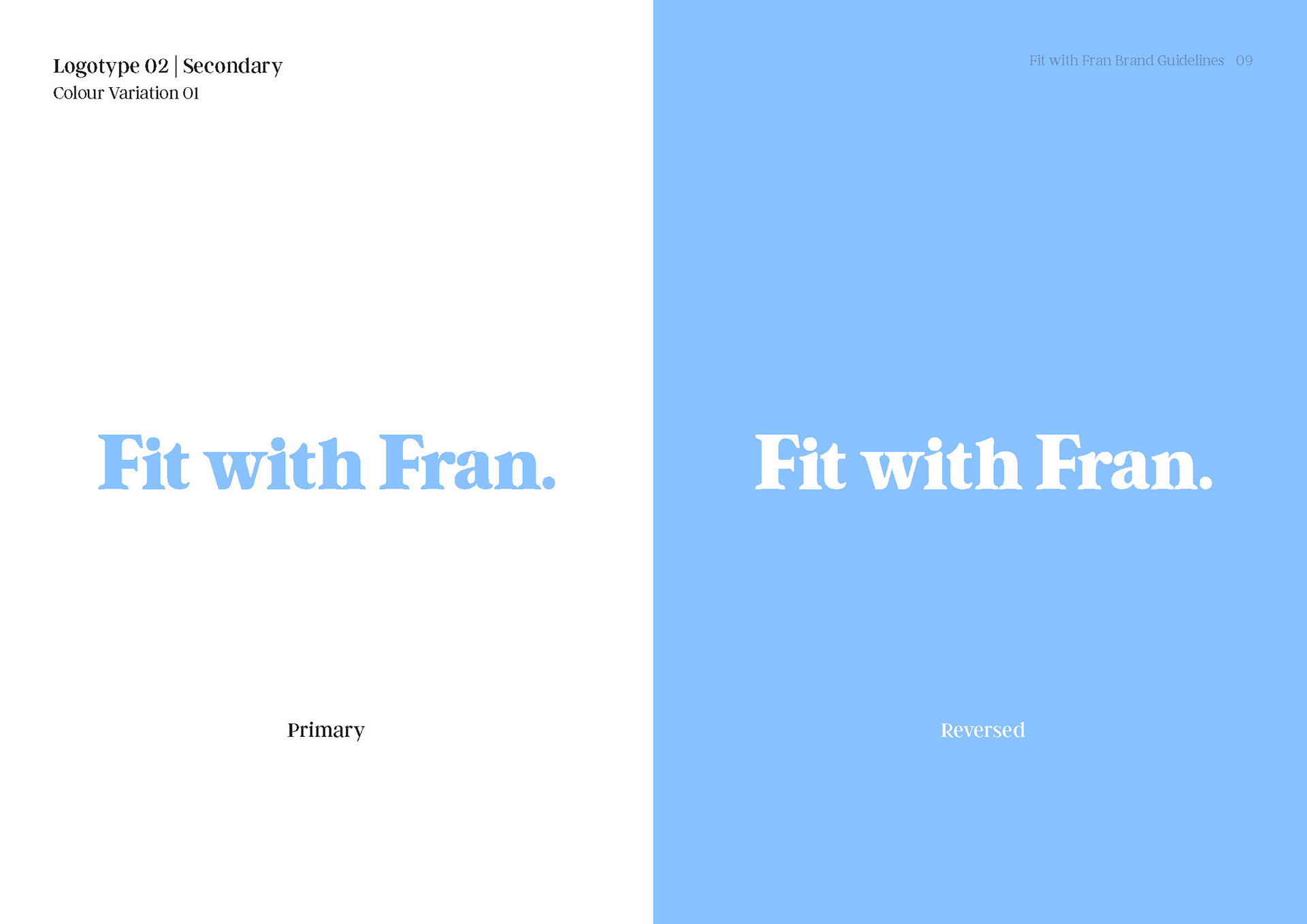
Designed as a responsive system, the wordmark exists in stacked and horizontal variations to maintain clarity and recognition across digital and print contexts, while allowing for future adaptability across evolving applications.
The rounded, chunky serif structure introduces a subtle sense of playfulness and interaction, with considered use of negative space shaping its character and form. Tight kerning allows the letterforms to nest comfortably while maintaining legibility.
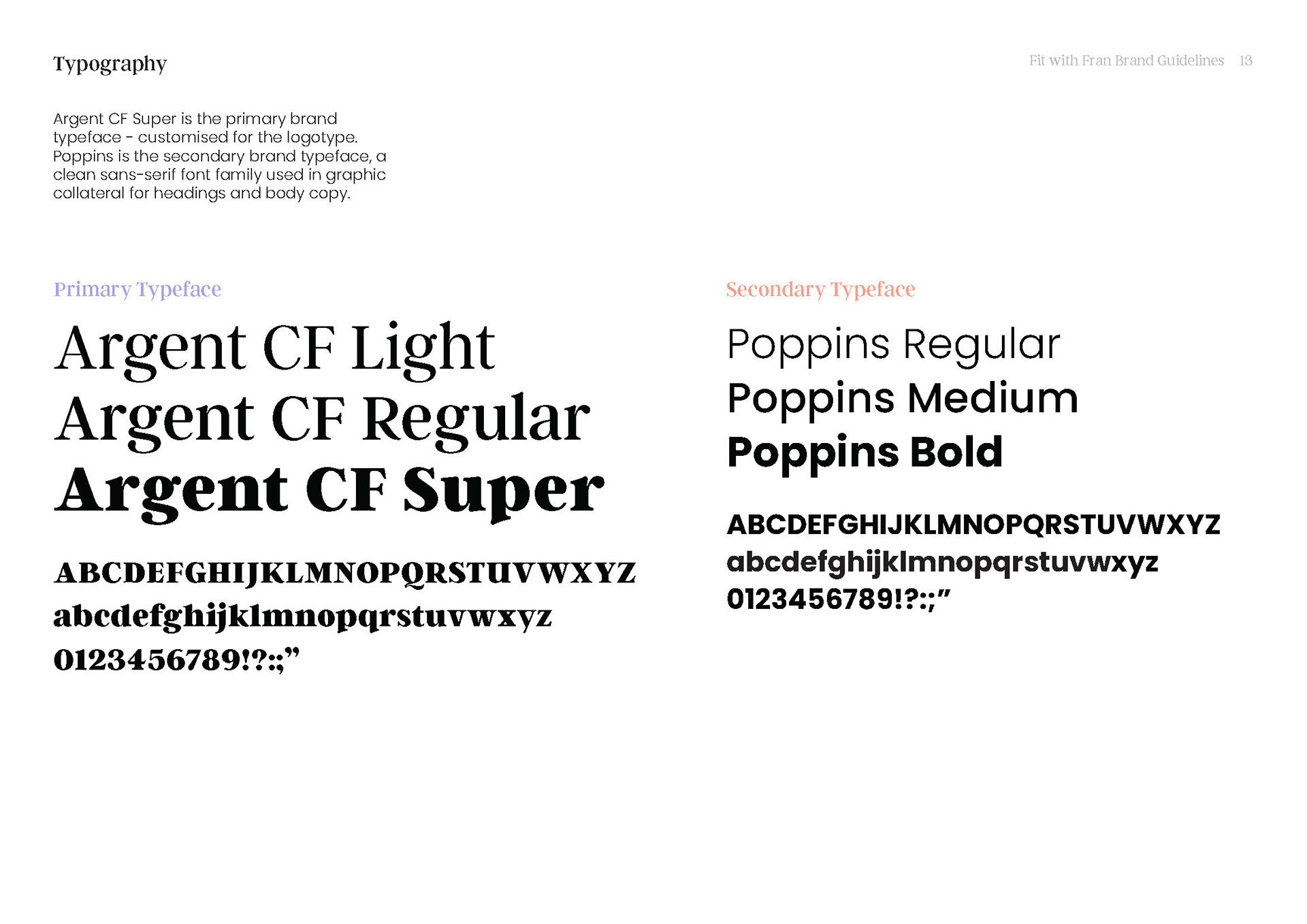
Typographic Expression
A New Colour Direction
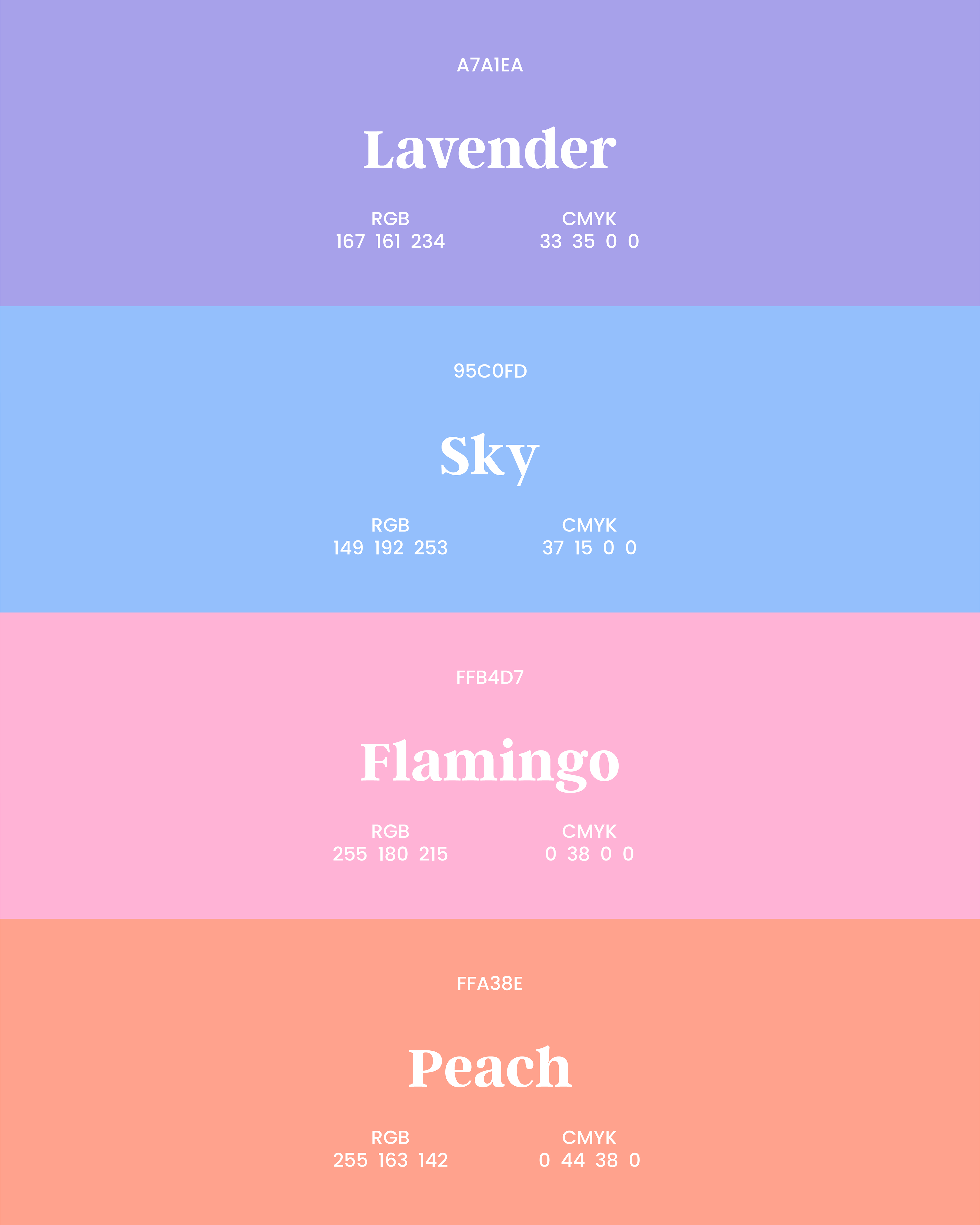
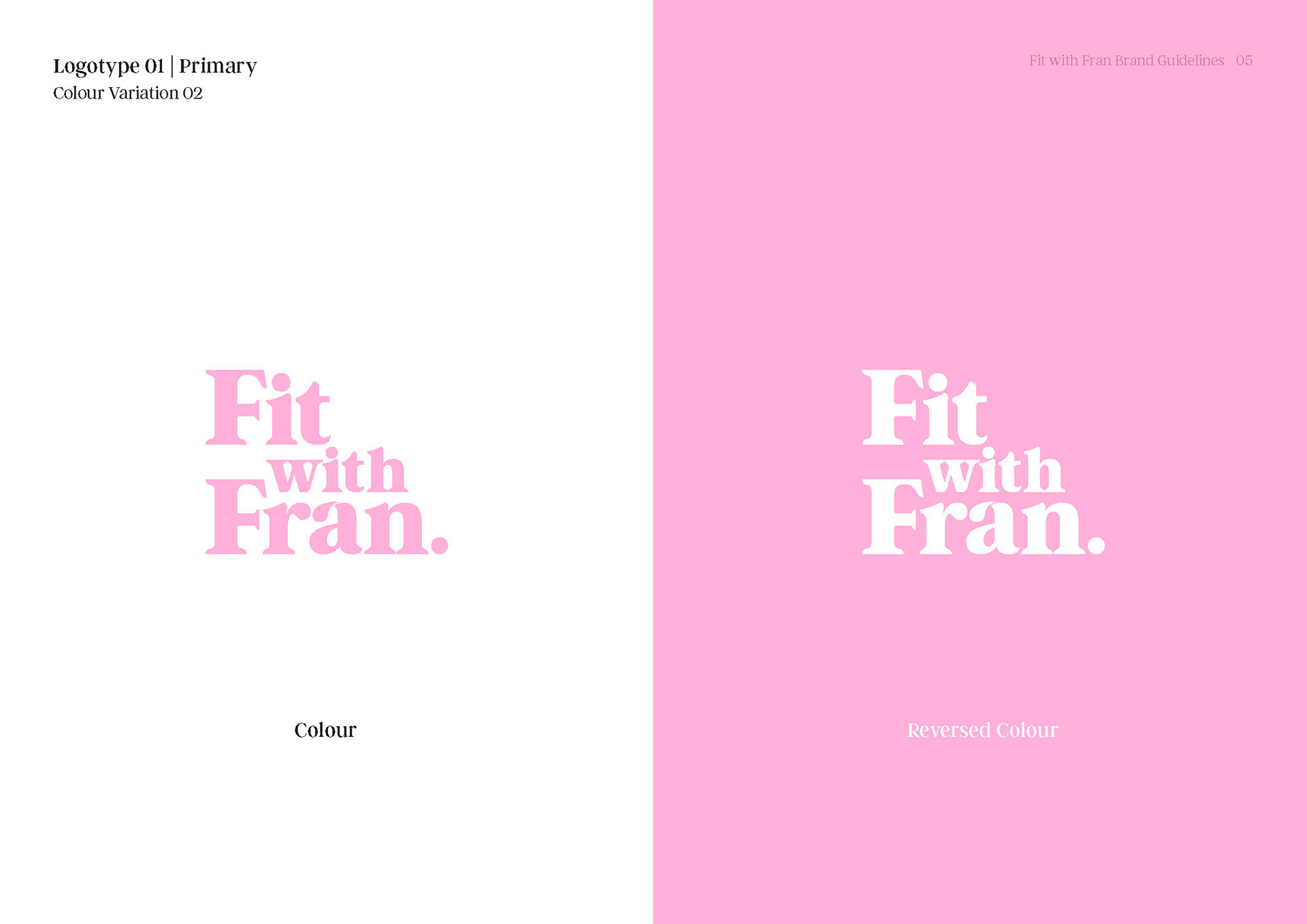
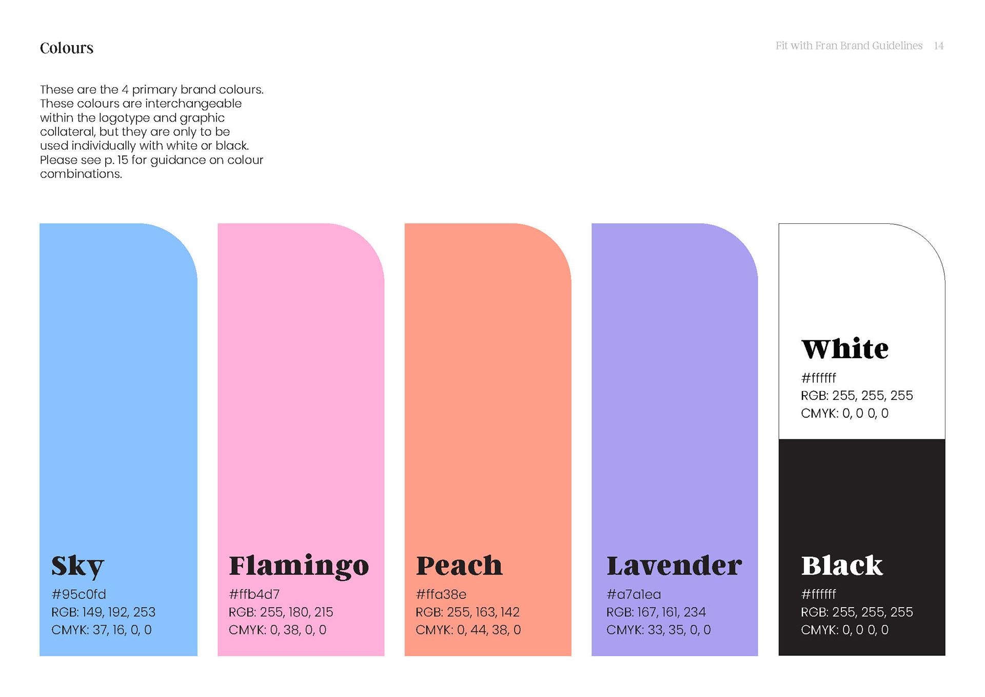
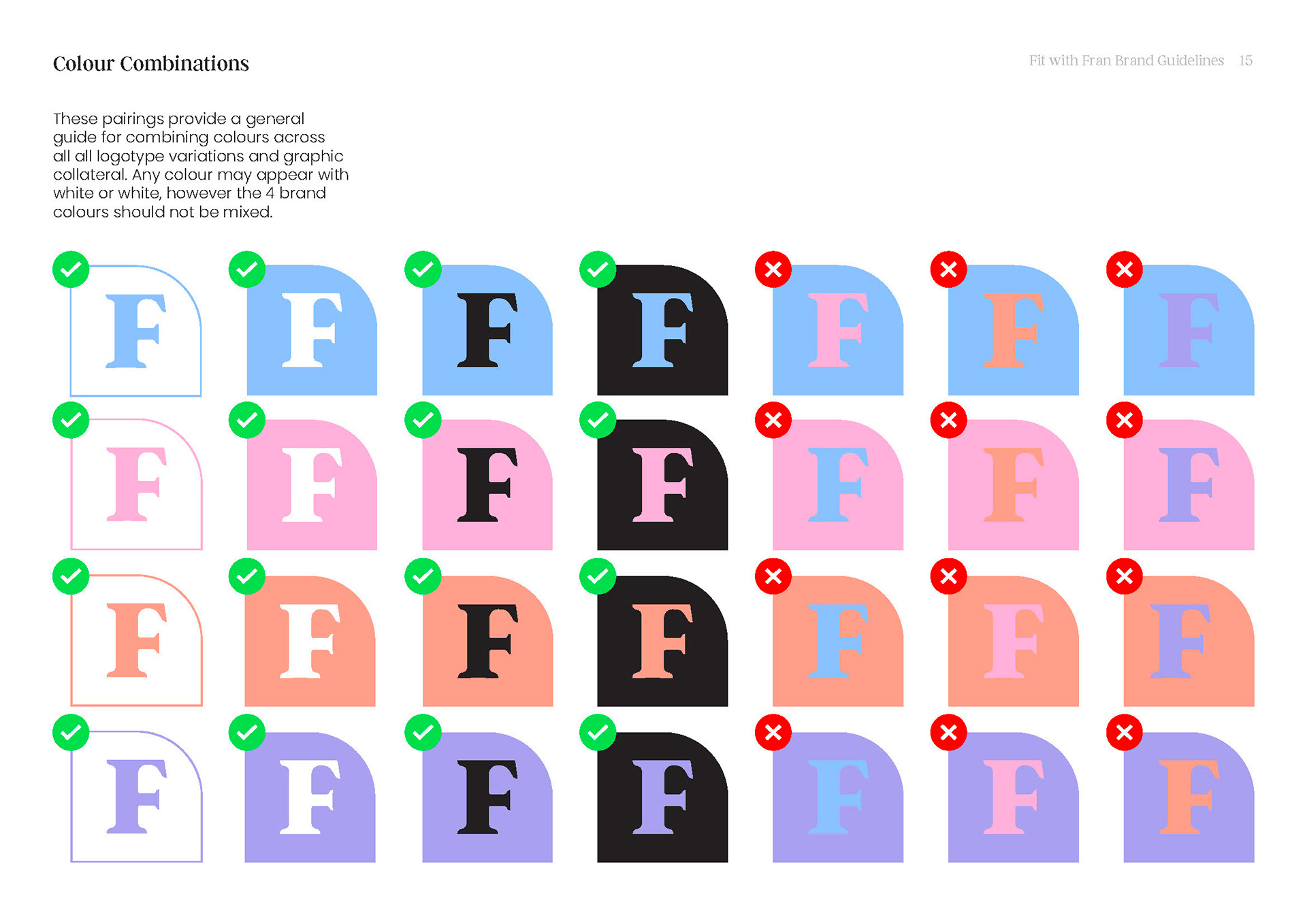
Reimagining the palette
To better resonate with a predominantly female audience, the client requested a shift towards a more feminine colour palette.
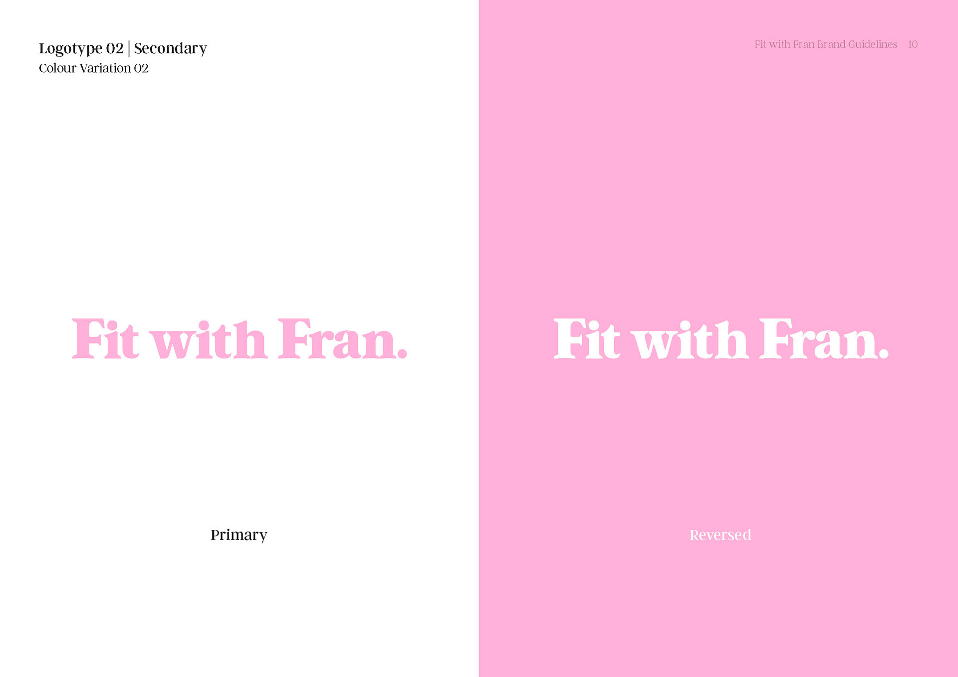
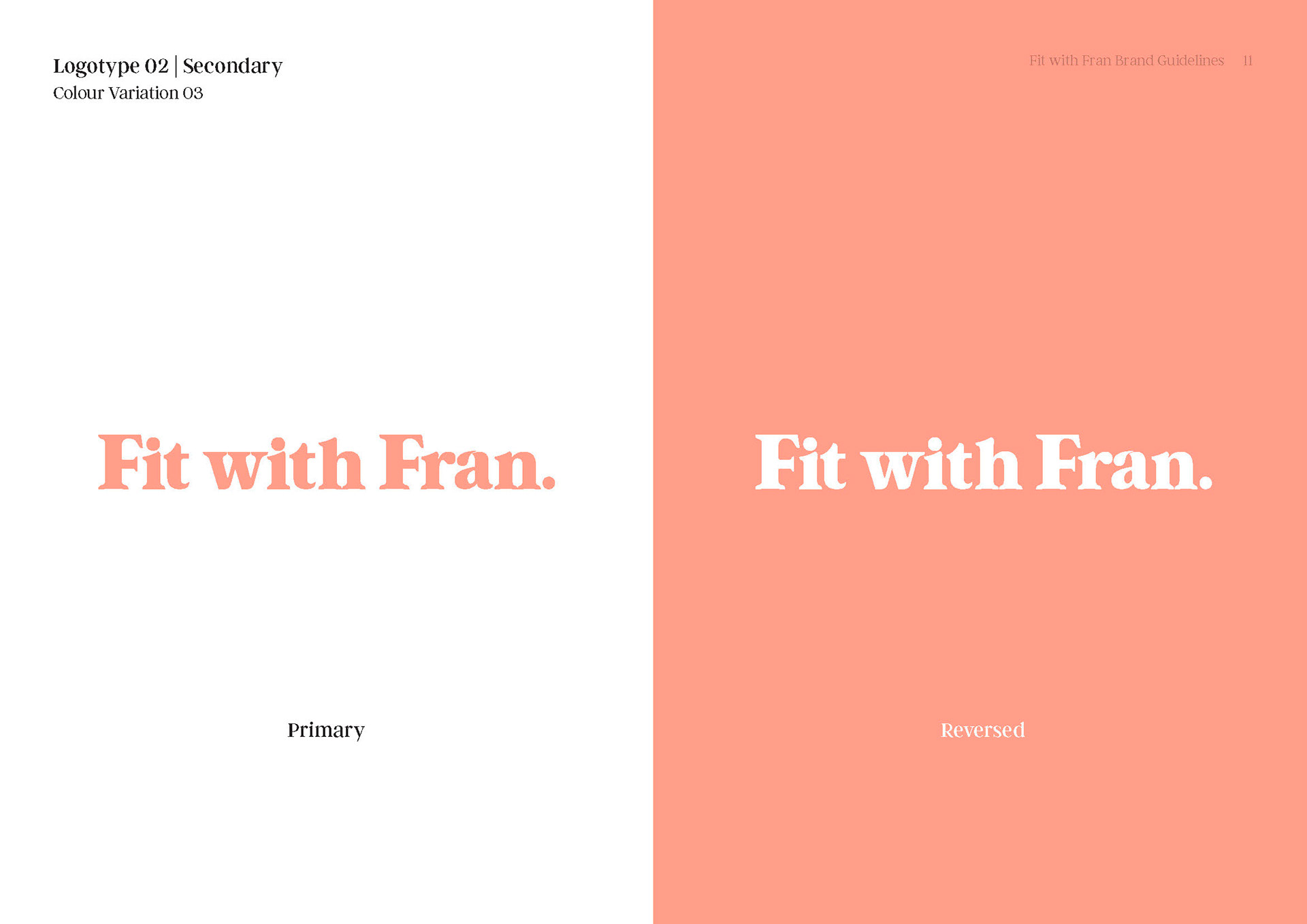
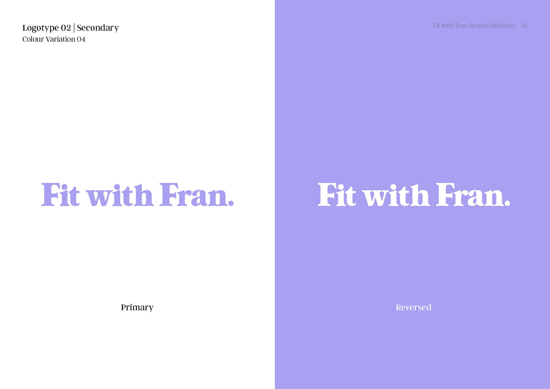
The resulting system introduces a set of soft, muted pastel hues that can be applied across the logotype variations and visual collateral, with each colour designed to be used independently against black or white for balance and diversity.
Brand in Use
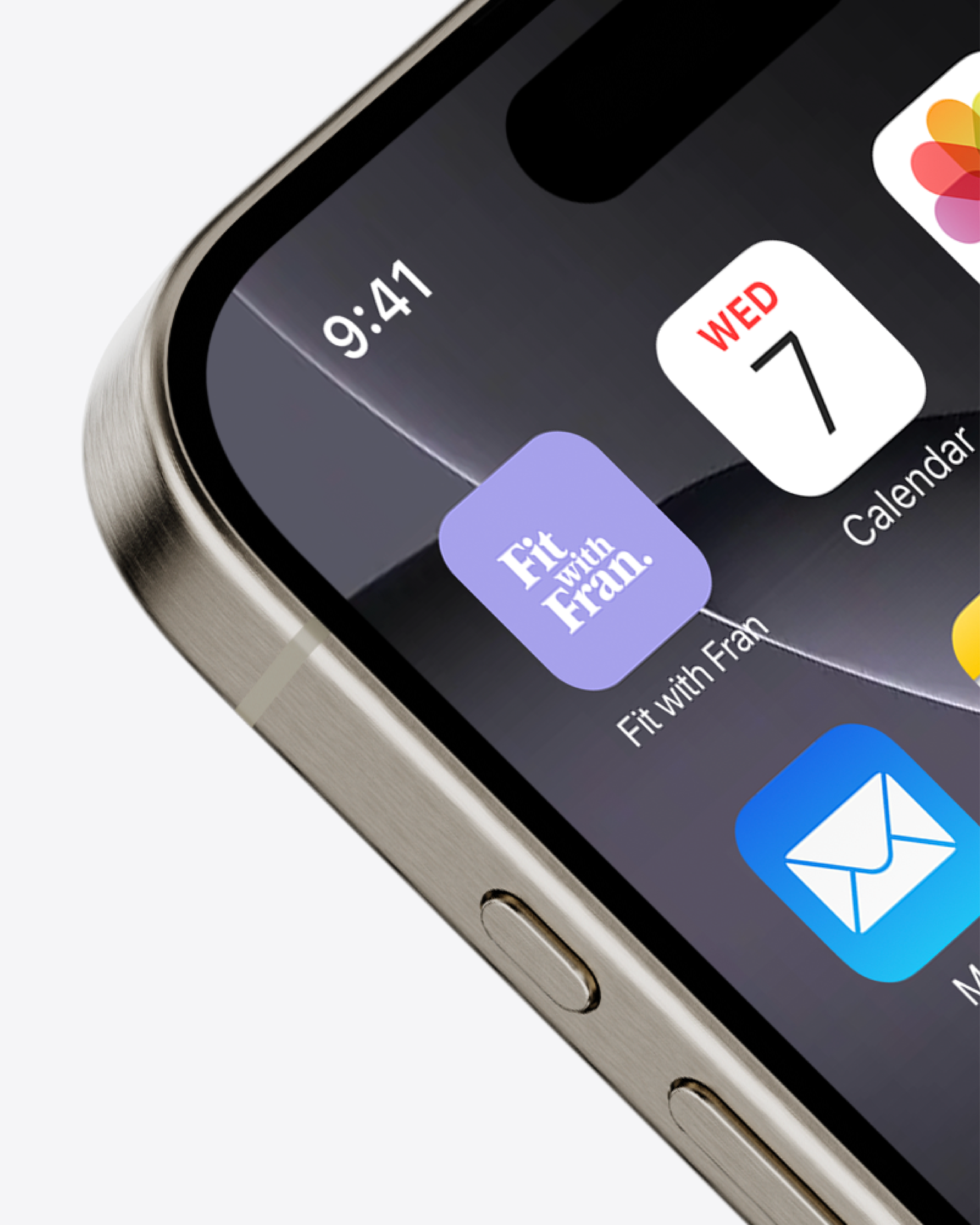
App Icon
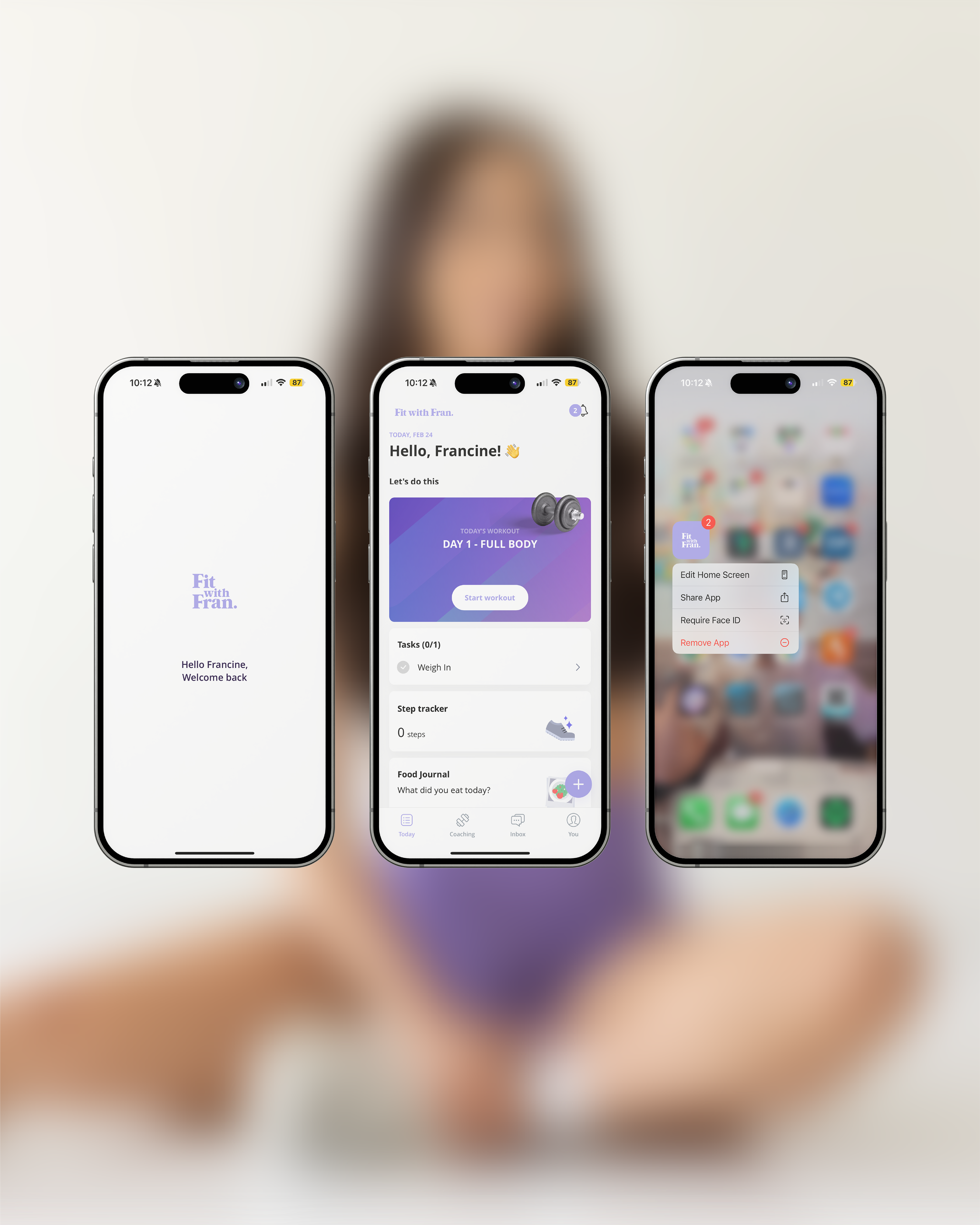
App Interface
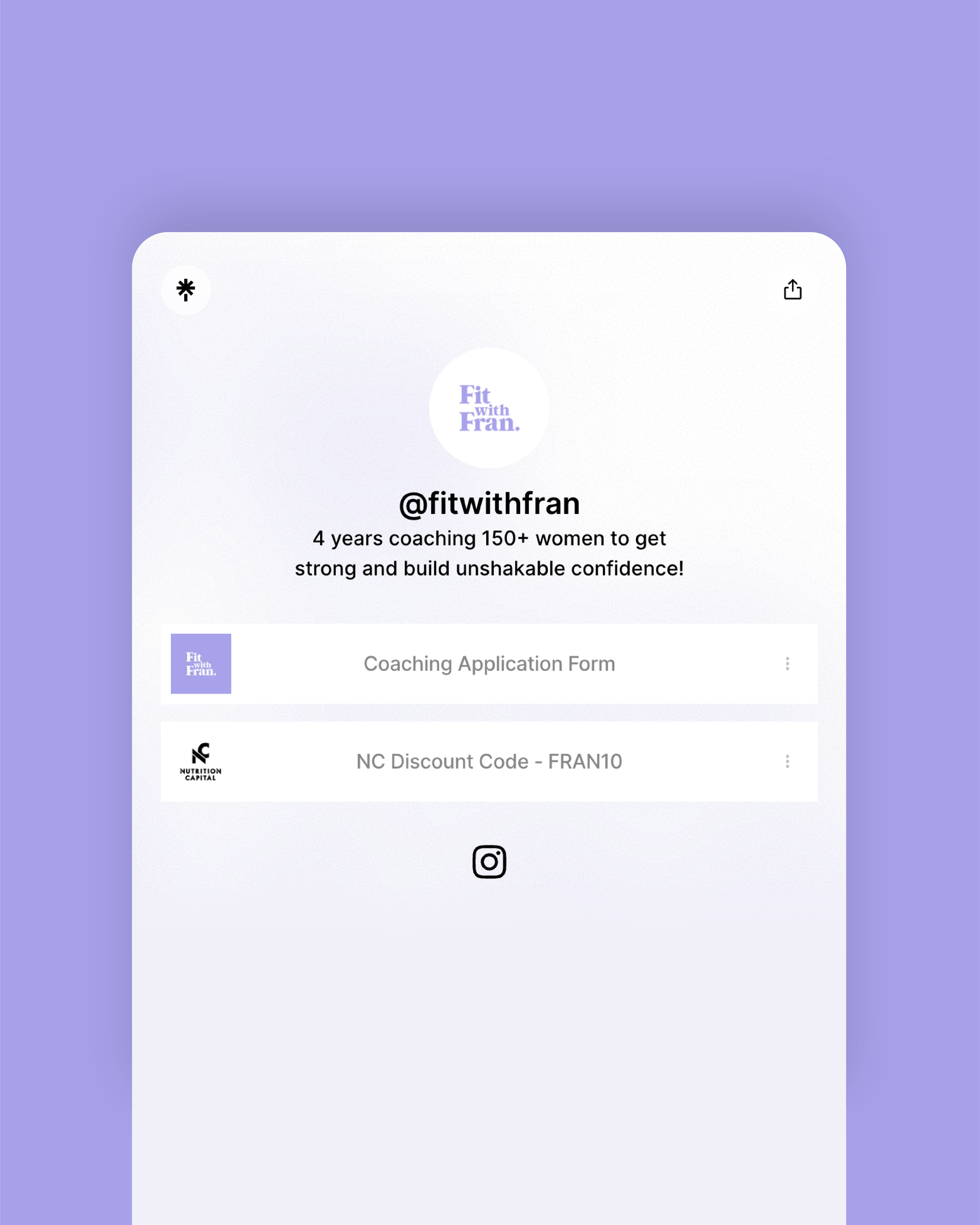
Linktree Interface
APP and social media INTEGRATION
Fit with Fran's coaching app serves as a key touchpoint where clients access their training programs, meal plans, progress tracking and coaching resources.
The refreshed identity was developed with digital scalability in mind, ensuring a seamless and user-friendly experience across app and social platforms.
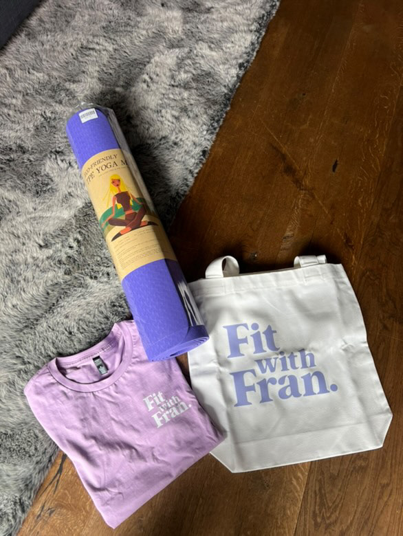
A system built to adapt across formats
While Fit with Fran’s brand identity was largely expressed through digital touchpoints, there was opportunity to expand its presence through print including apparel, stationary and accessories.
This made scalability essential, with the logo system designed in flexible primary and secondary variations to ensure consistency and impact across both small-scale and large-format outputs without losing integrity.
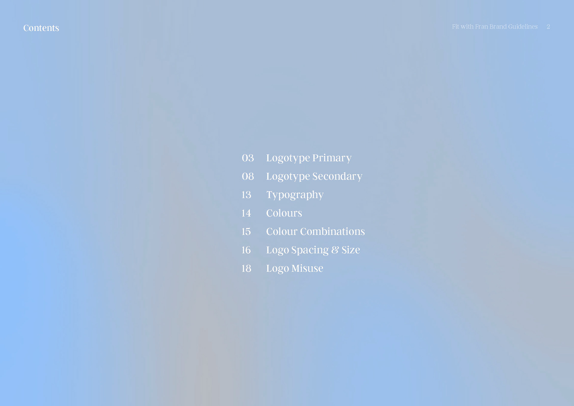
Brand Guidelines