
Australian Environments on Screen
BRAND IDENTITY
Pioneering, charting and changing relationships between people and the Australian environment.
How do you capture the relationship between storytelling, landscape and environmental change in a single visual identity?
Australian Environments on Screen required a brand identity that could speak to multiple audiences at once — from film, television and media communities, to environmental advocates, researchers and academics. The challenge was to create a visual language that felt culturally relevant, contemporary and adaptable, while reflecting the project's focus on Australia's natural environments and their representation on screen.
Four Elements, One Identity
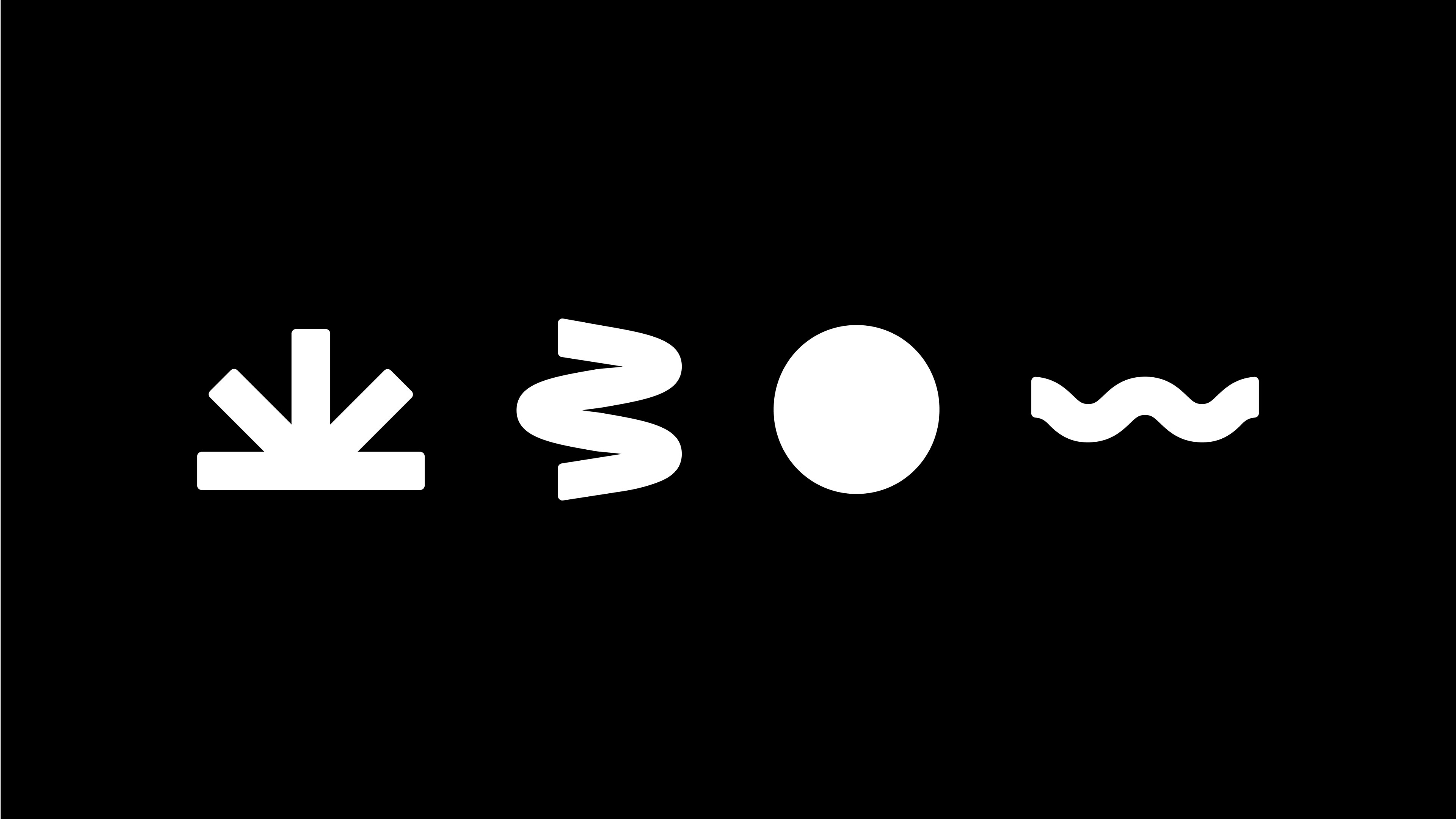
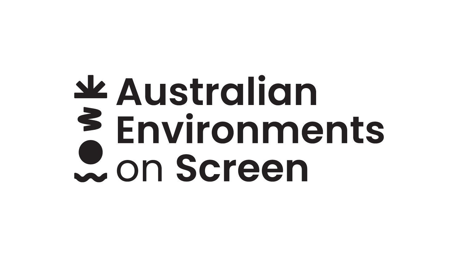
This identity is built around the four elemental forces that shape our environment. Arranged in sequence, the symbols reflect a natural hierarchy, drawing on the relationship between Sun, Air, Earth and Water.
While each form represents a distinct environmental element, together they create a unified brandmark that speaks to the interconnected nature of Australia's ecosystems. When paired with a black and white colour story, it draws reference to monochromatic film, creating a visual link to screen-based narratives.
Sun
The radiating, asterisk-like form references sunlight and heat, evoking the intensity of Australia's climate while symbolising illumination, storytelling and visibility.
Air
Represented through fluid, directional curves, the air symbol captures the invisible yet powerful presence of wind. Soft movement communicates the dynamic nature of atmospheric systems and environmental change.
Earth
Our earth is round, yet made up of many layers. Taking cues from the round form of the letter “O”, the simplicity of this mark depicts the planet as a whole, while hinting at the many unseen layers that exist beneath the surface.
Water
Constantly in motion, water is always shaping and transforming the environments it touches. The symbol's continuous wave-like form references ripples, tides and flowing currents, capturing a sense of rhythm and movement.

Shaping the Colour Language
Telling Stories Through Form
Initial refinement of the brandmark involved the use of colour as a structural tool, with each element distinctly identified through dependent colour application. Early iterations utilised green and red variations, referencing elements within the native Australian environment and establishing a direct connection to place.
The identity was ultimately resolved in a black and white palette, supported by a restrained green accent, resulting in a contemporary yet archival aesthetic.
This decision allows the logo to exist as a timeless standalone mark, while strengthening the clarity of negative space and the structural relationships within each letterform.
The identity provides a flexible foundation for web, social media and motion-based outcomes while remaining deeply connected to the project's environmental focus.
Logo in Use